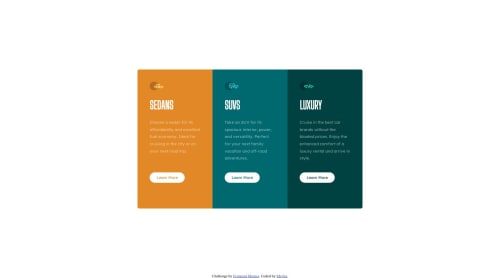
3-column preview card using flexbox

Solution retrospective
Hi All,
I started building this project with mobile first approach. I used CSS flexbox to align the elements. However, as I progressed with my code the layout for Website design ended up getting distorted and when I fixed that, the mobile layout is not working in the current solution.
For instance, if I remove the following CSS code, then I get the <div> elements stacked on top of each other in mobile layout.
.row{ display: flex; justify-content: center; }
But then it brings the <div> elements to the left and I am not able to come up with an efficient solution to center them. I also used Margin property, but then it doesn't go well with screen changes.
Could anyone help me understand where I am going wrong? Many thanks!
Please log in to post a comment
Log in with GitHubCommunity feedback
No feedback yet. Be the first to give feedback on MeghaS4831's solution.
Join our Discord community
Join thousands of Frontend Mentor community members taking the challenges, sharing resources, helping each other, and chatting about all things front-end!
Join our Discord