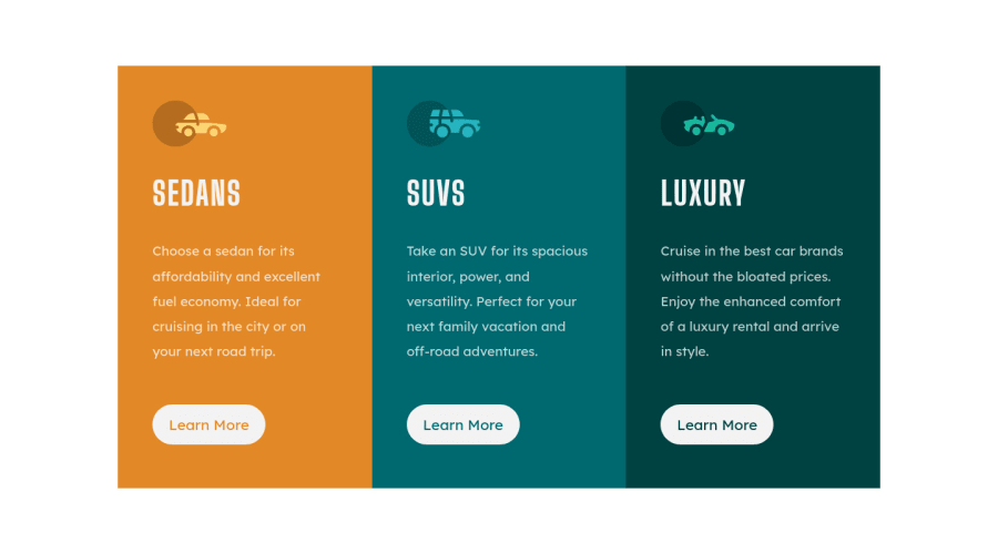
Design comparison
SolutionDesign
Solution retrospective
I'm on fire! (I think? :D) But seriously - I hope the effect is quite good :)
Community feedback
- @abhijitbcobPosted over 3 years ago
looking very nice! Here is my some tips:
- to center any element in body just only use
display: grid; place-items: center; - instead of writing row height, use padding inside every card component.
- in mobile view write
grid-template-columns: minmax(0, 325px)so that the card be responsive.
Marked as helpful0 - to center any element in body just only use
- @ToNisamBioJaPosted over 3 years ago
You indeed are on fire!
One small thing is that you forgot to put border radius on your boxes.
Good work here. Keep it up and happy codding!
Marked as helpful0@karbowskamPosted over 3 years ago@ToNisamBioJa Oh yeah, border radius. I forgot about it completely. I'm going to fix it. Thank you so much for your feedback :)
0
Please log in to post a comment
Log in with GitHubJoin our Discord community
Join thousands of Frontend Mentor community members taking the challenges, sharing resources, helping each other, and chatting about all things front-end!
Join our Discord
