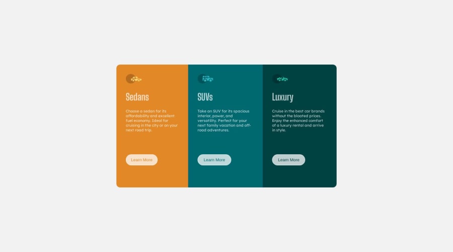
Design comparison
SolutionDesign
Solution retrospective
any feedback or comments are much appreciated :)
Community feedback
- @VickyAzolaPosted over 1 year ago
Hi 👋 great work finishing the challenge here are some tips that may interest you:
- if you look closely at the design the paragraphs are a little separated in the y axis, you can create this efect by using
line heightlike this:
p {
    margin-bottom: 70px;
    font-size: 12px;
    line-height: 2rem;
}
The number is just an example, you can play with the rems till it looks close to the design. Lastly, for responsive sites it is a better practice to use relative measures like rem or em, try practicing with them on your next project. Overall you did great with the challenge, congrats.
Hope this helps 🤞
0 - if you look closely at the design the paragraphs are a little separated in the y axis, you can create this efect by using
Please log in to post a comment
Log in with GitHubJoin our Discord community
Join thousands of Frontend Mentor community members taking the challenges, sharing resources, helping each other, and chatting about all things front-end!
Join our Discord
