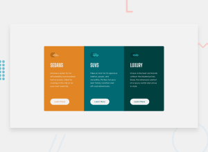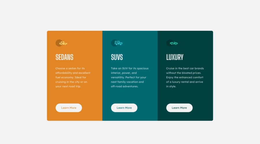
Design comparison
Solution retrospective
I appreciate any feedback :) Thank you!
Community feedback
- @darryncodesPosted almost 3 years ago
Hi Khadija,
Awesome solution, well done!
It might be cool to add
transition: ease .3s;to your button so the hover effect is smoother. Also you're adding a border on hover which is making the button jump slightly, add it before and that'll stop the jump.You could also clear your accessibility report if you swap
<div class="mainContainer">for a<main class="mainContainer">. And make<div class="attribution">a <footer class="attribution"> this would also need to moved out of the<main>to be semantically correct.All the best!
Marked as helpful2 - @RioCantrePosted almost 3 years ago
Hello there! Awesome job with this challenge, viewing your solution I would suggest the following for improvements:
- Adjust the
border-radiusof thebuttoninto30pxto make it look more rounded. - Add the hover states of each button with specific background colors, example:
.secondCard__btnContainer > button:hover { background: hsl(184, 100%, 22%); color: white; border: 2px solid white; }- Add a padding to the
.attributionto have space in between - Wrap the
.containerwithmaintag to make it more readable. - Add the
text-align: centerproperty to.attributionto make it align in the center which you can display it on smaller devices as well.
Once again, great job on this one and keep it going! Hope this helps.
Marked as helpful1@RioCantrePosted almost 3 years ago@Khadijarejjaoui99 Your welcome! I would appreciate it if you could mark it as helpful.
1 - Adjust the
Please log in to post a comment
Log in with GitHubJoin our Discord community
Join thousands of Frontend Mentor community members taking the challenges, sharing resources, helping each other, and chatting about all things front-end!
Join our Discord
