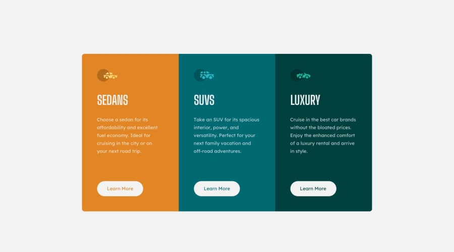
3-column preview card component with Sass and BEM
Design comparison
Solution retrospective
Any feedback is welcome.
Community feedback
- @Ayon95Posted almost 3 years ago
Good job completing this challenge. Your solution looks good. You can improve your HTML markup by using semantic elements like <article> and <section> instead of <div> for the card structure. The entire card component could be thought of as a standalone article and each sub-card within it can be considered a section.
Note that an article should always have a heading. If you don't need to show that heading, you can use CSS to visually hide it. The heading will still be accessible to screen readers.
<article class="card">
  <h1 class="visually-hidden">The article heading</h1>
  <section class="card__item">
  <section />

  <section class="card__item">
  <section />

  <section class="card__item">
  </section>
</article>
.visually-hidden { position: absolute; left: -1000rem; width: 1px; height: 1px; overflow: hidden; }Marked as helpful0@santiagosgPosted almost 3 years ago@Ayon95
Thanks, I'll take note of the article and the sections. About the H1, I actually put one in a header section and put visibility=0 and opacity=0 but apparently I have a level one header accessibility issue with the way I handled the H1, so next time I'll try it your way.
0@Ayon95Posted almost 3 years ago@santiagosg If you set visibility: hidden on an element, it gets removed from the accessibility tree, and therefore it will not show up in assistive technologies like screen readers. That's why the accessibility issue was raised for the h1.
0
Please log in to post a comment
Log in with GitHubJoin our Discord community
Join thousands of Frontend Mentor community members taking the challenges, sharing resources, helping each other, and chatting about all things front-end!
Join our Discord
