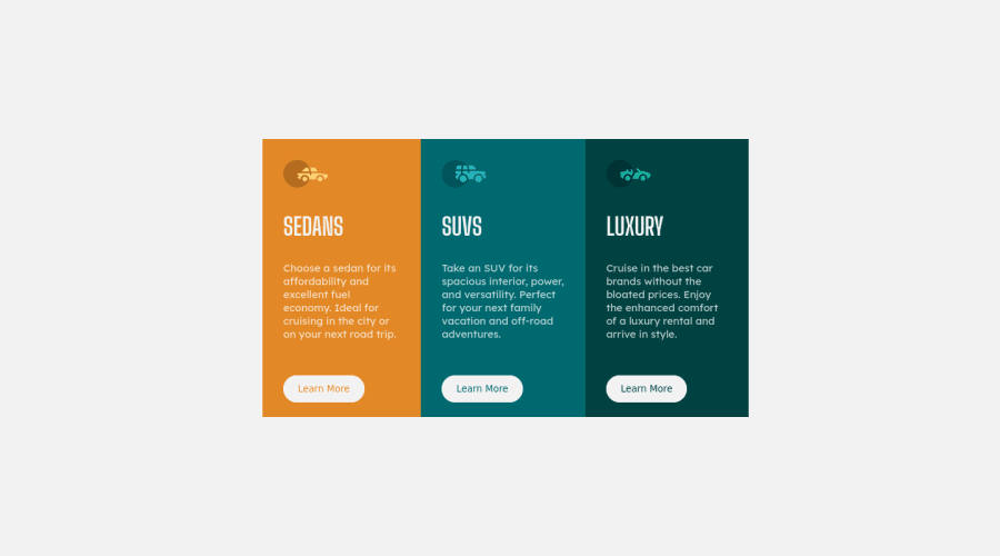
Design comparison
Solution retrospective
This is my first every challenge taken here so this is not perfect but, I believe this is pretty good. And also in my live website, I happened to use the slate theme from Github pages so the buttons are black and stuff. Nevertheless, I am really glad I took this challenge.
Community feedback
- P@kens-visualsPosted over 3 years ago
Hey @DummyKen 👋🏻 Ken's here 😅
I have some suggestions to help you fix the accessibility and HTML issues.
- In your markup,
<section class="card">...</section>should be<main class="">...</main>and<div class="attribution">...</div>should be<footer class="attribution">...</footer>. These will fix the accessibility and HTML issues. Don't forget to generate a new repot once you fix the issues. - For the music icon, add
aria-hidden="true”, because it's for decoration. You can read more aboutaria-hiddenhere. To illustrate:
<img src="./images/icon-sedans.svg" alt="" aria-hidden="true”>- Also, I suggest adding
transition: all 0.2s;to the button and the links, this will make:hoversmoother. - I've made a couple of changes in
.card, to fixborder-radiusand some other things, so here it is:
.card {
    display: flex;
    flex-direction: row;
    width: 700px;
    border-radius: 10px;
    overflow: hidden;
}
as you can see, I omitted
heightbecause fixedheightprevents your website from being fully responsive. Also, I omittedmarginbecause I have a different suggestion to help you fix the card in the center.- Now let's bring the card to the center of the scree:
body {
    background: hsl(0, 0%, 95%);
    min-height: 100vh;
    display: flex;
    align-items: center;
    justify-content: center;
    flex-direction: column;
}
I just used flexbox, which will make sure that on any viewport width, the card is positioned correctly.
- Lastly, I won't go into details about resetting CSS, but I'll leave this cool article here, which will make more sense than my brief explanation.
I hope this was helpful 👨🏻💻 Other than that, you did a great job for the first project, well done. Cheers 👾
Marked as helpful2@DummyKenPosted over 3 years ago@kens-visuals Hey Ken! Ken here again :). Thank you so much for providing such an insightful feedback on my project. I've fixed the accessibility issues just as you said. Will be taking more challenges from here. Thanks again. Cheers!
0 - In your markup,
Please log in to post a comment
Log in with GitHubJoin our Discord community
Join thousands of Frontend Mentor community members taking the challenges, sharing resources, helping each other, and chatting about all things front-end!
Join our Discord
