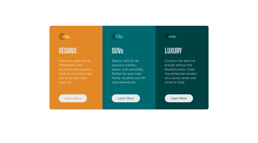
3-column preview card component with Bootstrap
Design comparison
Solution retrospective
Hello, Frontend Mentor coding community. This is my solution for the 3-column preview card component .
If you've any advice of, how can I improve my CSS/HTML structure, you're welcome!
Community feedback
- @VCaramesPosted over 2 years ago
Hey @amulyalovescoding, some suggestions to improve you code:
-
The car images/icons serve no other purpose than to be decorative; They add no value. Their Alt Tag should left blank and have an aria-hidden=“true” to hides it from assistive technology.
-
The headings are being use incorrectly. The <h1> Heading can only be used ONCE per page. For this challenge, each heading is equally as important. So best option, is to use <h2> Heading, because it will give each card the same level of importance and it's reusable.
-
Your "buttons" were created with the incorrect element. When the user clicks on the button they should directed to a different part of you site. The Anchor Tag will achieve this.
-
Do not use percentages for your CSS values. The moment you did, you lost all control on how you content will look like on different screen sizes. Currently, your content is being distorted as I decrease/increase the screen size.
Happy Coding! 👻🎃
Marked as helpful1@amulyalovescodingPosted over 2 years agoHi @vcarames, thanks for your valuable feedback. I will implements these changes from now on.
Thanks again.
0 -
Please log in to post a comment
Log in with GitHubJoin our Discord community
Join thousands of Frontend Mentor community members taking the challenges, sharing resources, helping each other, and chatting about all things front-end!
Join our Discord
