Design comparison
Solution retrospective
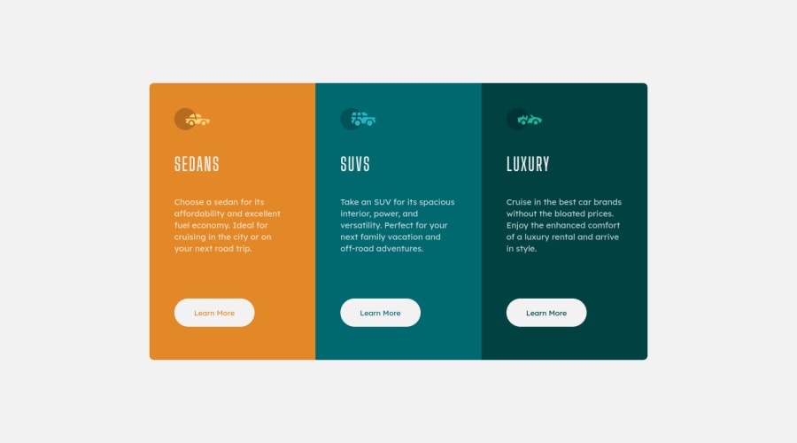
Hey guys, so I completed this preview card w/ flex-box with a fully responsive layout, and semantic HTML. Let me know how I did and where I can improve in.
Community feedback
- @correlucasPosted over 2 years ago
Hello Tom, congratulations for your solution!
I've inspected your code and look the live site and its everything good. All the content match.
If was your the only thing I would change is the breakpoint for mobile media query, I think the site changes the column flow vertically too early and in
width: 760px;the info doesn't fit so good vertically, you could set this media query for 500px and let the horizontal columns a little bit more, but this is only a matter of design.Congrats, everything seems good and super-flexible.
Marked as helpful1@ComanderPotatoPosted over 2 years ago@correlucas Thanks Lucas! Yeah I had some problems with the media query I didn't want to do it that early but since that all I was doing was changing the flex-direction, It had this purple box (I'm not too sure what its called) surrounding it that only showed in the developer tools that was giving it a lot of margin between the element and the width of the screen, so I did it a bit earlier, unfortunately not overly happy with the width of the card between 500-700px. But thank you anyway slowly getting better :).
1@correlucasPosted over 2 years ago@ComanderPotato Ahh! That's fine, another thing you can do is control the paragraph
widthwhen the media query changes this way you\ll not have so many long paragraph lines without linebreak.1@ComanderPotatoPosted over 2 years ago@correlucas ohh yeah that would've been smart to do since the paragraph was the reason it was stretching the box
1
Please log in to post a comment
Log in with GitHubJoin our Discord community
Join thousands of Frontend Mentor community members taking the challenges, sharing resources, helping each other, and chatting about all things front-end!
Join our Discord
