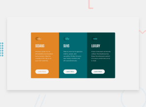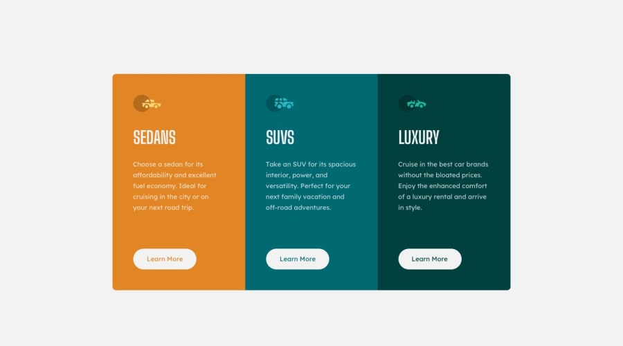
Design comparison
Solution retrospective
EN: This is my solution for the 3-column preview card component. Feel free to leave any feedback about the solution or the code! Thank you very much in advance!
PT: Esta é a minha solução para o desafio 3-column preview card component. Sinta-se à vontade para deixar qualquer feedback sobre a solução ou sobre o código! Desde já, muito obrigado!
Community feedback
- @PhoenixDev22Posted over 2 years ago
Hello Luciano Oliveira,
Your solution looks great. I have some suggestions regarding your solution, If you don't mind:
HTML
- About
<h1>it is recommended not to have more than one h1 on the page . Multiple<h1>tags make using screen readers more difficult, decreasing your site’s accessibility. You can add a<h1>withclass="sr-only"(Hidden visually, but present for assistive tech).
- In this challenge , the images are much likely to be decorative. For any decorative images, each img tag should have empty
alt=""as you did andaria-hidden="true"attributes to make all web assistive technologies such as screen reader ignore those images .
- What would happen when the user click those learn more?In my opinion, clicking those "learn more" would likely trigger navigation not do an action so button elements would not be right. So you should use the <a>.
- There are so many repeated style rules , better to use reusable and manageable classes. For example: each column have the same styles , So you can use a class .cardComponent for the shared styles, then for each distinct styles like (background color)use another class. . cardComponent 1, . cardComponent2 . cardComponent 3
- Really important to keep css specificity as low/flat as possible. It’s not recommended use the ids to target the DOM elements for styling purposes , using ID's creates problem due to the specificity , better to use class so that it could be more manageable and reusable. IDs have a much higher specificity than classes) IDs have many uses in a webpage aside from being a CSS selector. For example as page anchors, fragment identifiers or to link labels to form fields.
Aside these , Good work! Hopefully this feedback helps
Marked as helpful1 - About
- @correlucasPosted over 2 years ago
Fala Luciano, beleza? Parabéns pelo desafio completo!
Acabei de olhar sua solução aqui e apesar de já estar muito boa, tem como você simplificar mais ainda o
grid layout.Por exemplo, pra criar esse grid com 3 colunas basta um
grid-template-column: 1fr 1fr 1fr;emax-width: 900pxdesse jeito automaticamente você cria um componente com 3 colunas de 300px cada.Dai quando o design for virar mobile, vai bastar uma media query dizendo
grid-template-columns: 1fr;, porque com uma coluna só, os cartões vao ser forçados a ficar um embaixo do outro.PROPOSTA DE CÓDIGO.container { margin: auto; display: grid; grid-template-columns: 1fr 1fr 1fr; justify-content: center; align-content: center; /* width: 100%; */ max-width: 900px; }Espero ter ajudado e continue no foco!
Marked as helpful1
Please log in to post a comment
Log in with GitHubJoin our Discord community
Join thousands of Frontend Mentor community members taking the challenges, sharing resources, helping each other, and chatting about all things front-end!
Join our Discord
