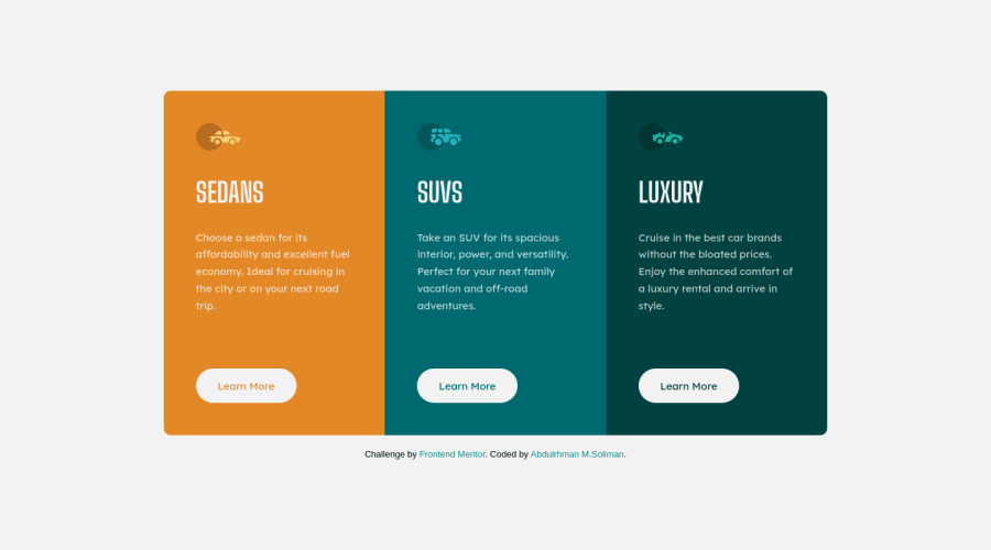
3-columns-Card Challenge 6
Design comparison
Solution retrospective
Your feedback is very appreciated to improve my code. Thanks.
Community feedback
- @VCaramesPosted almost 2 years ago
Hey there! 👋 Here are some suggestions to help improve your code:
- The web development process can be made easier and expedite the process 🚀 by implementing a
CSS Reset
. Here are some examples that you can freely use: Josh Comeau Reset, Eric Meyer Reset
- Change ⚠️ the
height
tomin-height
in yourbody
element, to improve your component's responsiveness.
- Implement a "Mobile First" approach 📱 > 🖥
Mobile devices are now the dominant 👑 way in which people browse the web, it is critical that your website/content looks perfect 💯 on all mobile devices.
More Info: 📚
- For improved accessibility 📈 for your content, it is best practice ✅ to use
em
formedia-queries
. Using this unit gives users the ability to scale elements up and down, relative to a set value.
If you have any questions or need further clarification, feel free to reach out to me.
Happy Coding! 🎆🎊🪅
Marked as helpful1@AbdulrhmanSolimanPosted almost 2 years agoHello, @vcarames
Thank you very much for reviewing my code. I really appreciated your time. This feedback is very helpful, it has a lot of improvements for me.
I wish I can see such this feedback in my next challenges❤️.
1 - The web development process can be made easier and expedite the process 🚀 by implementing a
- @MelvinAguilarPosted almost 2 years ago
Hello there 👋. Good job on completing the challenge !
I have some feedback for you if you want to improve your code.
HTML 📄:
- You should use only one
<h1>
tag per page. The<h1>
tag is the most important heading tag, This can confuse screen reader users and search engines. This challenge requires thatSedans
,SUVs
andLuxury
are headings, but you can use the<h2>
tag instead of the<h1>
tag. You can read more about this here 📘.
- You should use the
<a>
tag instead of the<div class="more">learn more</div>
tag because theLearn More
element is a link to another page. A div tag is a generic container element that can be used to group other elements together. It can be used to create a structure for a page, or to separate sections of content. It is also useful for styling and positioning elements on a page. Use links to navigate to another page. You can read more about this here 📘.
- Not all images should have alt text. Car icons are for decoration purposes only, so they can be hidden from screen-readers by adding
aria-hidden="true"
and leaving its alt attribute empty:
<img src="./images/icon-sedans.svg" alt aria-hidden="true"> <img src="./images/icon-suvs.svg" alt aria-hidden="true" > <img src="./images/icon-luxury.svg" alt aria-hidden="true" >
I hope you find it useful! 😄 Above all, the solution you submitted is great!
Happy coding!
Marked as helpful1@AbdulrhmanSolimanPosted almost 2 years ago@MelvinAguilar Thank you for this amazing feedback and for reviewing my code. I will make these changes as soon as possible.
1 - You should use only one
Please log in to post a comment
Log in with GitHubJoin our Discord community
Join thousands of Frontend Mentor community members taking the challenges, sharing resources, helping each other, and chatting about all things front-end!
Join our Discord