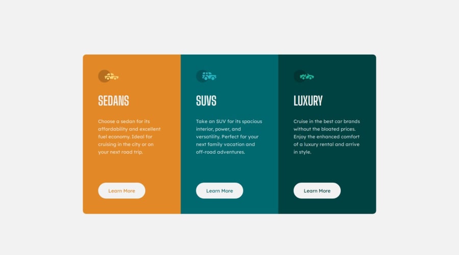
3-column preview card component using SCSS, Grid, BEM
Design comparison
Solution retrospective
Hi everyone! I'll be glad to your feedback! Thanks!
Community feedback
- @Bishalsnghd07Posted 9 months ago
Hi, @ankkiel 👋
Congrats for completing this challenge🎉 and great job well done👏
I'm in mobile now so, that I can give feedback related that:
Just one small adjustment you have to do make your layout responsive in mobile too, just give some padding in your body tag and your layout will look responsive in mobile too.
I hope this small tip will help you!
Happy Coding❤️
Marked as helpful1@ankkielPosted 9 months agoHi, @Bishalsnghd07 ! 👋
Really, I didn't notice the lack of padding at the top and bottom for mobile devices. Fixed it now, looks so much better than it was!
Thanks for your help! ❤️
0@Bishalsnghd07Posted 9 months ago@ankkiel For best practice
paddingshould be in body not in child component, I already mentioned this above.0
Please log in to post a comment
Log in with GitHubJoin our Discord community
Join thousands of Frontend Mentor community members taking the challenges, sharing resources, helping each other, and chatting about all things front-end!
Join our Discord
