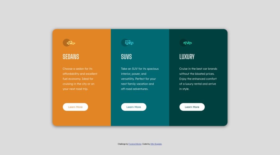
3-column preview card component using HTML/CSS
Design comparison
Solution retrospective
Something weird is happening with the first item button (the orange one) when it turns to the mobile layout. The sensible area gets just to the left side of the button. Still have no explanation for that...
Community feedback
- @karishma-devPosted almost 3 years ago
Hi @Bragdale, Your solution looks good and responsive. In your mobile layout, your attribution is interfering with the first item button. You just need to add
z-index: -1to your attribution in mobile layout. This will cause your attribution to be behind the first item button.And one more thing, don't use both internal and external css in your HTML file. Add the attribution code that you have in internal css file to your external css and delete it from your html file.
Hope this helps you solve the problem you are facing. :)
Marked as helpful1
Please log in to post a comment
Log in with GitHubJoin our Discord community
Join thousands of Frontend Mentor community members taking the challenges, sharing resources, helping each other, and chatting about all things front-end!
Join our Discord
