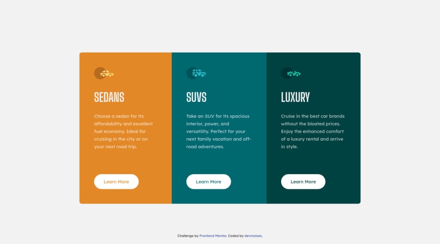
3-column preview card component using HTML & CSS Flexbox
Design comparison
Solution retrospective
This challenge is very interesting, it has its details to consider, I really liked it. I await your advice and recommendations. Thanks.
Community feedback
- @gsterczewskiPosted over 3 years ago
Hello Moises π, my name is Grzegorz.
You did really good job, and implemented the design almost perfectly.
One minor thing to improve is to add
focus
state to the anchors, so user can navigate it with keyboard.Of course those links are dead, but I think it is a good practice to remember about a11y (I'm working on it myself).
Overall, excellent work, I'm hoping to see more of your work here.
Keep up the good work! πͺ
See you on the coding trail π
Cheers!
Marked as helpful1@devmoisesPosted over 3 years ago@GSterczewski thank you very much for the recommendation on the focus, I did not know it but now I will apply it.
0 - @ToNisamBioJaPosted over 3 years ago
Hello!
Really good job on this one. You got it really close to the original design and added a nice hover animation.
The only thing you could change is the border radius but thats about it.
Keep it up! Happy codding!
Marked as helpful0@devmoisesPosted over 3 years ago@ToNisamBioJa thank you very much for your comment, I will take into account your recommendation about border radius. βοΈ
0@devmoisesPosted over 3 years agoHi @ToNisamBioJa I forgot to ask if the change was for the border-radius of the button or the card? Greetings.
0 - @Dups11Posted over 3 years ago
Hi, just a little improvement :
For better results with border radius you should :
-
Border-radius: 10px on section "cards" not on the "card_items"
-
overflow-hidden on section "cards"
Apply this rules after remove all other border-radius.
Marked as helpful0@devmoisesPosted over 3 years ago@Dups11 thank you for your comment, I will take your recommendations into account.
0@devmoisesPosted over 3 years agoHello @Dups11, apply your recommendations and they look good, although I have not uploaded it to the repository yet for some doubts. In the prototype the middle card has the complete radius-edges and in the last one they only have the right top and the right bottom (this in the pc version). Will it be part of the challenge to consider those options or should we apply it as part of an upgrade?
0 -
- @palgrammingPosted over 3 years ago
Really slick hover animation. Great Job πππππ
Marked as helpful0@devmoisesPosted over 3 years ago@palgramming Thank you very much, I am learning about animations with CSS from scratch, it is great I will be applying them in the following challenges. π
0
Please log in to post a comment
Log in with GitHubJoin our Discord community
Join thousands of Frontend Mentor community members taking the challenges, sharing resources, helping each other, and chatting about all things front-end!
Join our Discord