Design comparison
SolutionDesign
Solution retrospective
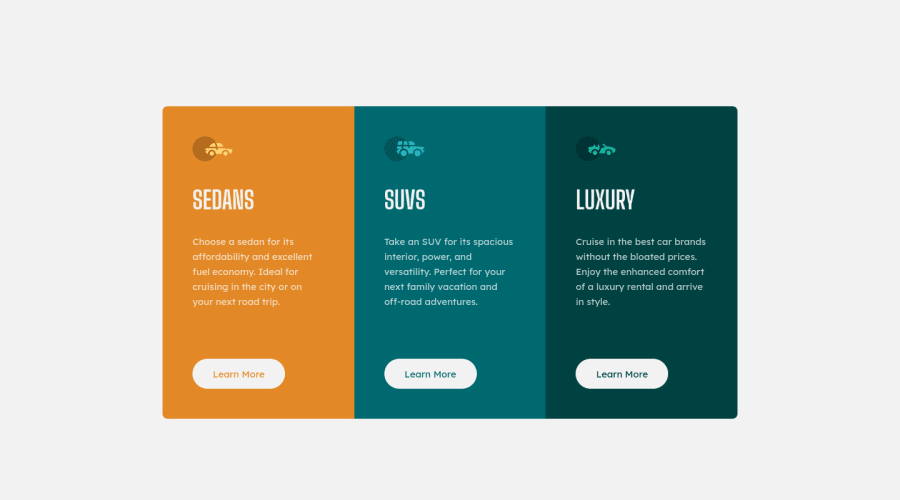
Cards are not centred vertically at the desktop design mockup. I used margin at the top of wrapping container to shift cards down. Is there any best practice for such layouts? Why are there always HTML issues when I submit solution with *-inline or *-block declarations?
Community feedback
- @PhoenixDev22Posted over 2 years ago
Hi rishat-se,
Another great solution from you. I have some suggestions regarding your solution:
HTML
- About
<h1>it is recommended not to have more than one h1 on the page . Multiple<h1>tags make using screen readers more difficult, decreasing your site’s accessibility. You can add a<h1>withclass="sr-only"(Hidden visually, but present for assistive tech). Then you can use<h2>instead of those<h1>.
- In this challenge , all the images are decorative. For any decorative images, each img tag should have empty
alt=""as you did andaria-hidden="true"attributes to make all web assistive technologies such as screen reader ignore those images .
- Imagine what would happen when the user click those
learn more? Clicking those"learn more"would likely trigger navigation not do an action so button elements would not be right. So you should use the<a>.
- Adding
rel="noopener"orrel="noreferrer"totarget="_blank"links. When you link to a page on another site usingtarget=”_blank”attribute , you can expose your site to performance and security issues.
Aside these, your solution is great. Happy coding!
Marked as helpful1@rishat-sePosted over 2 years agoHello PhoenixDev22,
Thank you! Your feedback about HTML is very helpful. I will definitely use all your advises in the next challenge.
Happy coding!
1 - About
Please log in to post a comment
Log in with GitHubJoin our Discord community
Join thousands of Frontend Mentor community members taking the challenges, sharing resources, helping each other, and chatting about all things front-end!
Join our Discord
