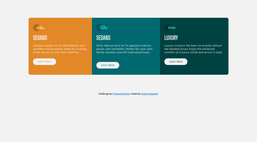
Design comparison
SolutionDesign
Solution retrospective
Any suggestions on how I can improve are welcome!
Community feedback
- @KarthikRaja1388Posted about 2 years ago
Your solution looks great.
As you're already using flex, to center the container please set body as flex as below:
body{ display flex; min-height:100vh; justify-content: center; align-items:center; } attribution div may collapse when you set body to flex, so use flex-direction as column.
Marked as helpful0@osamanazakatPosted about 2 years ago@KarthikRaja1388 Thank you for your suggestion Broth 😍
0
Please log in to post a comment
Log in with GitHubJoin our Discord community
Join thousands of Frontend Mentor community members taking the challenges, sharing resources, helping each other, and chatting about all things front-end!
Join our Discord
