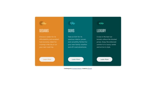
3-column preview card component using CSS grid and flexbox
Design comparison
Solution retrospective
Writing the code for the mobile site, i kept wanting all of the content to fit within the page so i wouldn't have to scroll. Eventually i gave up.
If you think that's possible please let me know. Thank you.
Community feedback
- @Kingsleigh-ObiPosted about 1 year ago
Before you start to create the layout of the web page for mobile devices, make sure you zoom out totally, this helps to fit everything in one page before you start creating the responsive page.
Marked as helpful1 - @Abu-SmanPosted about 1 year ago
Hey @ziyyahh, you did a great job! keep going. I don't think you can make the card component fit the page without scrolling on a mobile device. However, i do notice that the content of the card jumps up a lil bit when you hover the buttons. To fix that, you can use the box shadow with the inset keyword to add the border instead of just using the border property or you can add the border and make it transparent and only display it on hover state. You can check my version of the solution here to see how i solve it https://github.com/Abu-Sman/3-column-preview-card-component-solution. Also, your readme isn't describing your project, use the readme-template instead. Don't forget to edit it. Hope this helps.
Marked as helpful0@ZiyyahhPosted about 1 year ago@Abu-Sman Hi, thank you for your feedback, i just implemented it and it worked perfectly, I'd update my repository.
1
Please log in to post a comment
Log in with GitHubJoin our Discord community
Join thousands of Frontend Mentor community members taking the challenges, sharing resources, helping each other, and chatting about all things front-end!
Join our Discord