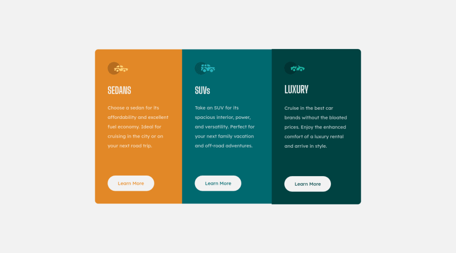


Design comparison

Community feedback
- @vanzasetiaPosted almost 3 years ago
Hi there! 👋
I recommend using flexbox since the layout for the cards is not a two-dimensional layout. Flexbox is great for a one-dimensional layout.
I suggest wrapping the card elements with
mainlandmark. After that, make themainelement as the flex container for all the card elements.For the
bodyelement, you can use the grid to center the layout.Also, I would recommend writing the CSS with the mobile-first approach. It often leads to shorter and better performance code. Also, mobile users won't be required to process all of the desktop styles.
That's it! Hope this helps.
Marked as helpful0 - @farukingPosted almost 3 years ago
You can use flex instead of grid and use flex-wrap to make it responsive but you still have to use media-queries to remove the border-radius in mobile mode. Though grid and flex can be used interchangeably, flex is usually used for arranging items in a single direction(horizontal or vertical) while grid is usually used for arranging items in both directions. Here is a link to learn more about flex link and here is another link to learn about media queries link.
Marked as helpful0


Please log in to post a comment
Log in with GitHub
Join our Discord community
Join thousands of Frontend Mentor community members taking the challenges, sharing resources, helping each other, and chatting about all things front-end!
Join our Discord