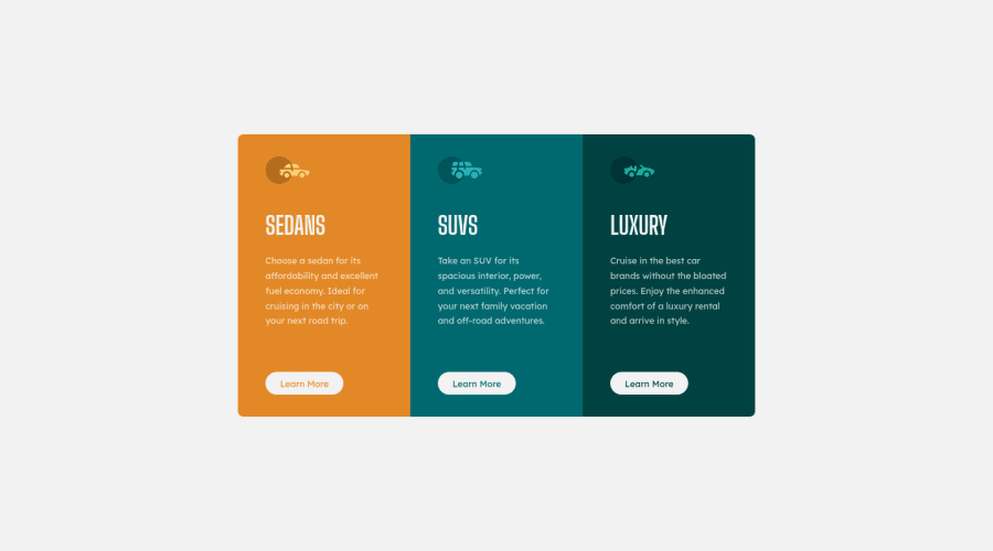
3-column preview card component using CSS Flexbox
Design comparison
Solution retrospective
Good day guys! This is my first challenge here on frontendmentor.
I'd like to ask for your opinions on my solution, especially using media queries, I know I used more than expected which is bad practice, I also want to know if there's a better approach to the challenge without using media queries. Thank you all!
Also, the text sizing and spacing gave me issues, together with the individual boxes' height and width
Community feedback
- @deeolaPosted over 3 years ago
Good Job John, Clean design and really awesome effort.
About your question about Media Queries, what i would do is to start by wrapping my boxes in a container div(you can also use your main too like you did ). My next step would be designing at about 315px (Mobile-first), then add breakpoints at about 481px for tablets and 769px for desktops(and display the container div as flex at this point). So, instead on using max-width with your media-query, you are going to use the min-width property.
Overall, it's a very awesome design.
Welcome to the frontend community bossman.
1@johnayanyemiPosted over 3 years ago@clazikar Thanks a lot for the feedback
I'm happy to be here
0@johnayanyemiPosted over 3 years ago@clazikar Hi there! I've implemented the changes now, please do check it out
0@johnayanyemiPosted over 3 years ago@clazikar Hi there! I've implemented the changes now, please do check it out
0@deeolaPosted over 3 years ago@johnayanyemi
Great Job once again.
I observe that on your mobile view, you attached display:flex to some elements (Like, main.container and div.box)that are not neccessary(writing fewer css is one of the advantages of coding mobile-first)
Another observaton is that your boxes are not responsive below 768px and that is because you have a max-width set on the boxes. So try and remove the max-width property on div.box, add a width of 100% and on your main.container, you can have a width of 90% or less(depends on you ) and set a 'margin:2em auto;' on it. This gives your .box container the same with as the main.container and shrinks according to that.
On your media query
--you can remove the 'flex-property:row' since it will be in row by default.
--Adding another set of padding to the main.container is disturbing the height of the middle box, Try and delete it. makes the box perfect at exactly 768px.
Don't be discouraged by these few corrections(they're minor fixes). You've done a great job.
P.S Check Kevin powell videos on height and width on youtube. It'll really help.
1@johnayanyemiPosted over 3 years ago@clazikar Thank you, I can't appreciate you enough, I'd go over it again
0 - @grace-snowPosted over 3 years ago
This looks really good, although I'm a bit concerned about the way you've used viewport units... I expect the consequences could be unexpected on some screens but not sure.
The other thing I wasn't sure about is why padding is different on each side of the boxes. That doesn't look necessary
Overall, you could definitely have css about the third of the length it is.
For example, you shouldn't need to set height on anything, just some padding and max-widths on the boxes, vertical margin on the box content elements, and one media query to change the flex direction. That is really all that's needed here (plus colors, font sizes, focus and hover states).
I hope that helps
1@johnayanyemiPosted over 3 years ago@grace-snow Thank you sooooo much. I'd make sure to look into all you've said on my next project
0@johnayanyemiPosted over 3 years ago@grace-snow Hi Grace, thanks so much for your feedback. I've implemented the changes now. Please do check it out
0
Please log in to post a comment
Log in with GitHubJoin our Discord community
Join thousands of Frontend Mentor community members taking the challenges, sharing resources, helping each other, and chatting about all things front-end!
Join our Discord
