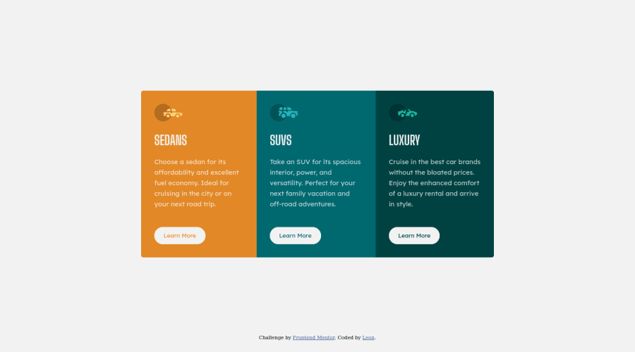
Design comparison
Solution retrospective
After coding along to tutorials for about a month I realized I was just coding along and not grasping concepts. So, I decided to give this a shot. It was pretty challenging but I learnt a lot!
Here are some challenges I encountered:
- Responsiveness: I used a desktop first approach to create the card. I then worked on the responsiveness but I wasn't able to make it responsive across all devices. So, I opted for a column layout for devices 768px and below. But, I feel this wasn't the best approach. Recommendations on how I could have done this better will be appreciated.
- Using CSS classes: I'm still learning how to use classes appropriately. I feel like I could have written less CSS than I did. Any feedback on how I've used CSS classes will be appreciated.
- Semantics: Finally, I'll appreciate any feedback on HTML semantics.
Finally, any additional comments and recommendations are welcome. Thanks! :-)
Community feedback
- @markup-mitchellPosted over 3 years ago
@rupiacodes try taking a mobile-first approach next time. I struggle to articulate the benefits beyond saying "you will find it easier" or "you get more for free".
You can achieve the mobile design with less CSS, which means you're only adding what you need to reach tablet/desktop designs in an additive way, as opposed to trying to take stuff out... I hope that makes sense!
I don't think your CSS is obviously bloated, but it is a bit confusing.
The following looks like a utility class:
.dark-cyan {
  background-color: var(--dark-cyan);
}
But there are different properties that could take that color:
colorbackground-colorborder-color
.bg-dark-cyanmight be better if you take this approach.And then you have these classes:
.bright-orange {
  background-color: var(--bright-orange);
  border-top-left-radius: 5px;
  border-bottom-left-radius: 5px;
}
.very-dark-cyan {
  background-color: var(--very-dark-cyan);
  border-top-right-radius: 5px;
  border-bottom-right-radius: 5px;
}
This will cause you problems very quickly. What has border radius got to do with being bright orange?!
Have a look the BEM CSS methodology and see what you think.
As well as for naming classes, I take a BEM-like approach to CSS custom variables. For organising your code and making best use of intellisense, you might find it helpful to change:
--bright-orange: hsl(31, 77%, 52%);
--dark-cyan: hsl(184, 100%, 22%);
--very-dark-cyan: hsl(179, 100%, 13%);
to something like:
--color__orange--bright: hsl(31, 77%, 52%);
--color__cyan--dark: hsl(184, 100%, 22%);
--color__cyan--very-dark: hsl(179, 100%, 13%);
Marked as helpful0@rupiacodesPosted over 3 years ago@markup-mitchell the tutorials I've been coding along too have been following a desktop-first approach. But I'll attempt this challenge again using a mobile-first approach to get a sense of the different workflow.
Honestly, I've kind of been winging it when it comes to naming classes. Thanks for sharing the BEM CSS methodology. I've skimmed through it and it looks like it will be quite useful going forward.
Thanks!
1 - P@dwhensonPosted over 3 years ago
Hey @rupiacodes congrats on completing your first challenge 🙌
Your use of CSS classes looks pretty good to me and that you are on the right track there.
Your semantics look pretty good, you could have gone for an
ulat the top level with each card being aliperhaps. I would probably go for that as it would announce to screen readers the number of items in the list at the start.One change I would make however, is to change your
buttonelements to links. Even though they look like buttons, I don't think they are in this case. As a general rule, if an element takes you to another place or page it's a link, if it does something (opens a model, dropdown menu etc), usually with JS, then it's a button.Lastly, try to avoid setting an explicit height on anything, in general... If I find myself wanting to do this it is a warning flag for me, and I should check if there is a better solution. In this case, if you want to center the component on the page, I would set the following on the body:
 min-height: 100vh;
 display: grid;
place-items: center;
This should work for a few other challenges too. But great one on moving from tutorials to building things!! 👍 Keep up the good work - learning and building go best together!
If anything is not clear please let me know
Cheers 👋
Dave
Marked as helpful0@rupiacodesPosted over 3 years agoHey @dwhenson thanks for the insights and encouragement. 😀
Everything you've recommended is clear but I haven't started learning grid yet. So, I'll stick to flex for now.
I'll implement your recommendations, see how it goes and update my solution.
Thanks!
0
Please log in to post a comment
Log in with GitHubJoin our Discord community
Join thousands of Frontend Mentor community members taking the challenges, sharing resources, helping each other, and chatting about all things front-end!
Join our Discord
