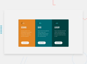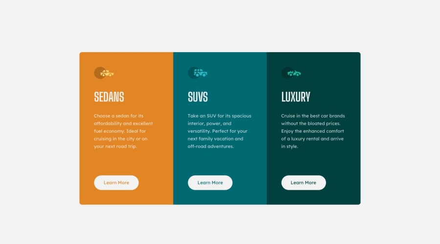
3-column preview card component using CSS Flex
Design comparison
Solution retrospective
I accept days and suggestions
Community feedback
- @VCaramesPosted about 2 years ago
Hey @matheusmorenocf, some suggestions to improve you code:
-
The car images/icons serve no other purpose than to be decorative; They add no value. There Alt Tag should left blank and have an aria-hidden=“true” to hides it from assistive technology.
-
The headings are being use incorrectly. The <h1> Heading can only be used ONCE per page. For this challenge, each heading is equally as important. So best option, is to use <h2> Heading, because it will give each card the same level of importance and it's reusable.
-
For media queries, I definitely suggest using em for them. By using px your assuming that every users browser (mobile, tablet, laptop/desktop) is using a font size of 16px (this is the default size on browser). Em's will help with users whose default isn't 16px, which can sometimes cause the your content to overflow and negatively affect your layout.
More Info:
https://betterprogramming.pub/px-em-or-rem-examining-media-query-units-in-2021-e00cf37b91a9
- Your CSS Reset is extremely bare. You want to add more to it.
Here are few CSS Resets that you can look at and use to create your own CSS Reset or just copy and paste one that already prebuilt.
https://www.joshwcomeau.com/css/custom-css-reset/
https://meyerweb.com/eric/tools/css/reset/
http://html5doctor.com/html-5-reset-stylesheet/
Happy Coding!
Marked as helpful1 -
- @vanzasetiaPosted about 2 years ago
Hello, Matheus! 👋
Congratulations on finishing this challenge! 👏
I agree with @vcarames has said about the alternative text. Those car icons are decorative images and don't add any meaningful information. So, it's best to hide those from screen reader users by leaving the alternative text empty (
alt="").Also, all the headings should have the same level. Otherwise, it would not make sense to have a heading structure like this:
- H1 Sedans
  - H2 Suvs
  - H2 Luxury
I recommend reading the "How-to: Accessible heading structure - The A11Y Project" article to learn how to use headings correctly.
Two things that I'd like to suggest.
- First, try to make the site looks closer to the design. The
bodyhas a gray background color. The cards should be bigger. - Second, I recommend adding
rel="noopener"to any anchor tags that havetarget="_blank". It helps protect users of legacy browsers. I suggest reading "Links to cross-origin destinations are unsafe" article to learn more about this.
That's it! I hope this helps!
Marked as helpful0 - First, try to make the site looks closer to the design. The
Please log in to post a comment
Log in with GitHubJoin our Discord community
Join thousands of Frontend Mentor community members taking the challenges, sharing resources, helping each other, and chatting about all things front-end!
Join our Discord
