

Design comparison

Solution retrospective
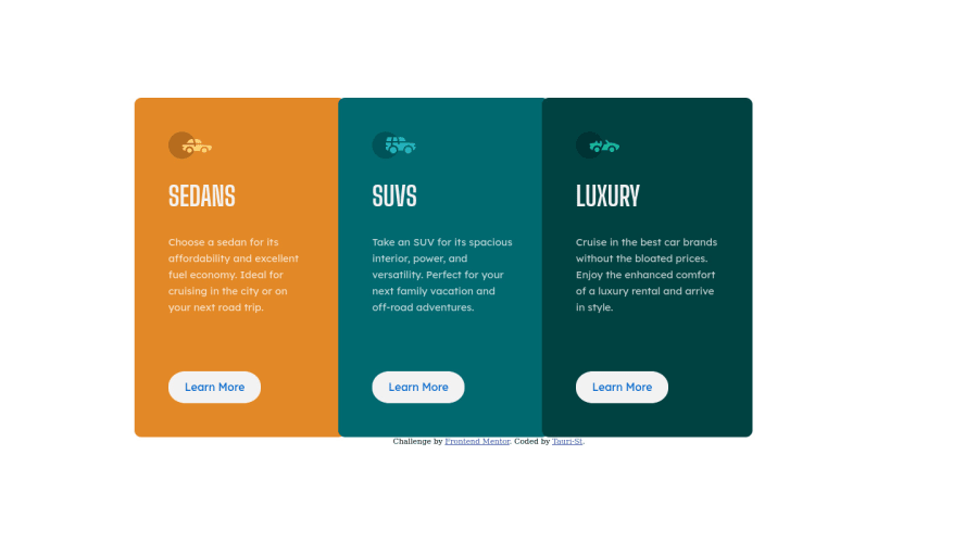
Got some awesome feedback from @correlucas! Aligned the body element in the center, rounded only the outer corners of the card layout. (the Figma design comp got funky with the corners compared to the clean indication of how the corners should be from the JPEG). I adjusted my media query so the row wrap appears starting with tablet sizes bc that makes sense for this small build.
I also added a descriptive invisible header to improve my accessibility with screen readers :)
Please give me feedback, I LOVE learning new things and I am already seeing some amazing ways to tackle this simple challenge!
Community feedback
Please log in to post a comment
Log in with GitHubJoin our Discord community
Join thousands of Frontend Mentor community members taking the challenges, sharing resources, helping each other, and chatting about all things front-end!
Join our Discord