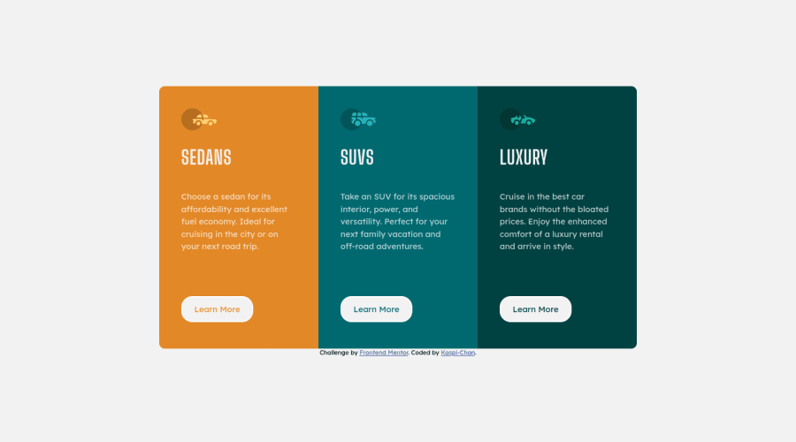
3-column preview card component solution using CSS Grid and Flexbox
Design comparison
Solution retrospective
Where can I do better? Open to suggestions!
Community feedback
- @MelvinAguilarPosted about 2 years ago
Hello again 👋. Good job on completing the challenge !
I have some suggestions about your code that might interest you.
HTML 📄:
- You should use only one
<h1>tag per page. The<h1>tag is the most important heading tag, This can confuse screen reader users and search engines. This challenge requires thatSedans,SUVsandLuxuryare headings, but you can use the<h2>tag instead of the<h1>tag. You can read more about this here 📘.
- You should use the
<a>tag instead of the<button>tag because theLearn Morebutton is a link to another page. Use buttons to perform actions like submitting a form or closing a modal and use links to navigate to another page. You can read more about this here 📘.
-
Not all images should have alt text. Car icons are for decoration purposes only, so they can be hidden from screen-readers by leaving its alt attribute empty.
You can read more about this here 📘.
I hope you find it useful! 😄 Above all, the solution you submitted is great!
Happy coding!
Marked as helpful2@Kaspi-ChanPosted about 2 years ago@MelvinAguilar Hello, Thanks for taking your time to look throughout my code! I usually know that about the h1s.. I don't know where my head was when i was doing the challenge :D. The part with the <a> tags instead of buttons was really eye-opening !
1 - You should use only one
Please log in to post a comment
Log in with GitHubJoin our Discord community
Join thousands of Frontend Mentor community members taking the challenges, sharing resources, helping each other, and chatting about all things front-end!
Join our Discord
