Submitted about 1 year ago
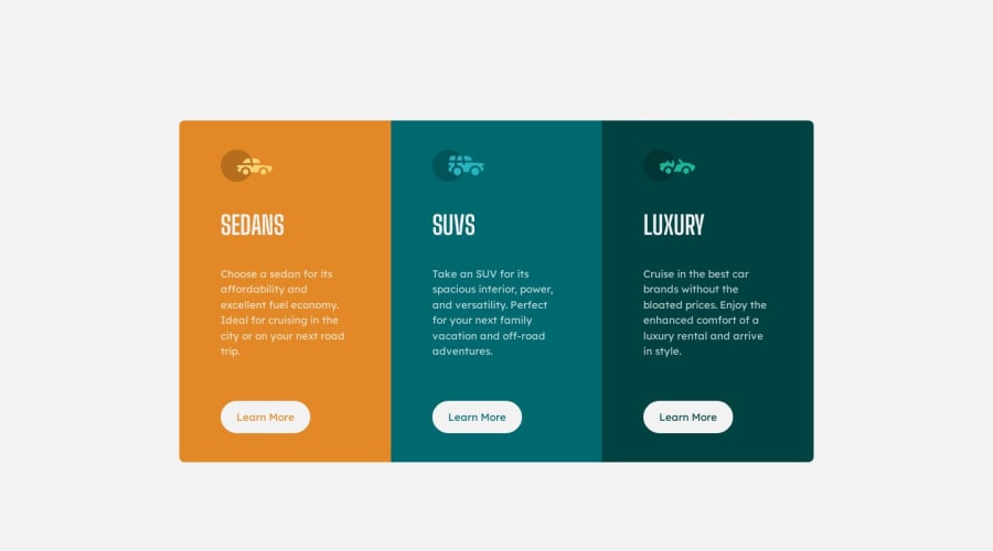
3-column preview card component | ReactJS Vite | Mobile First
@mayankdrvr
Design comparison
SolutionDesign
Solution retrospective
Hi Frontendmentor community,
This is my 3-column preview card component beginner challenge solution in ReactJS Vite. I had previously submitted a vanilla JS solution of the same challenge and had learned a lot from the feedback i had received. I request the community to review and give feedback for the live site and the shared source code on the following parameters-
- Does my solution visually matches with the design(colors, borders, font etc.)?
- Does it follow all the good web accessibility practices?
- Is the site mobile first and responsive on all devices?
- Do you have any other code refactoring suggestion with respect to ReactJS best practices?
Please feel free and do not hesitate to review my code and do give feedback for improvement. All suggestions are welcome. Waiting to learn from your feedback and experience. Thank you for reviewing my challenge submission.
Community feedback
Please log in to post a comment
Log in with GitHubJoin our Discord community
Join thousands of Frontend Mentor community members taking the challenges, sharing resources, helping each other, and chatting about all things front-end!
Join our Discord
