3-column preview card component: React sass app
Design comparison
Solution retrospective
I am happy with how much the CSS grid has simplified my HTML and minimize my media queries.
Community feedback
- @pikapikamartPosted over 3 years ago
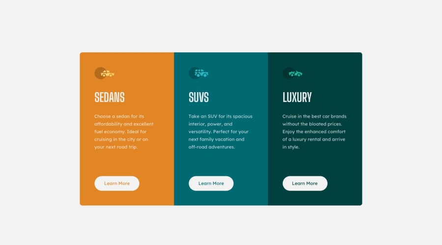
Hey, great work on this one. The layout is good both in desktop and mobile. Sizes only differs.
Two thing that bothers me is that, you used
buttonin the learn more instead of anatag which is the appropriate element on this. Button itself does nothing andatag are very important, since those learn more are supposed to be a links for the page to load. Changing them to a tag will be really good for your markup.The second one is that, when I hover on your learn more, the shape of the container resizes. As I inspected your css, I see that you are transitioning the border of it. Well it does add a small percent of width and height to the element. What you can do is that, instead of transitioning the whole border, transition the border-color. Those should look like this
.example {
  border: 0.25rem solid transparent;
  transition: border-color 0.3s ease;
}

.example:hover {
  border-color: red;
}
This will make sure that the border will not add anything when it is hovered, because the border is already present, the color of it is the only thing that will be changed.
Overall, great work. But those
atags are very important.0
Please log in to post a comment
Log in with GitHubJoin our Discord community
Join thousands of Frontend Mentor community members taking the challenges, sharing resources, helping each other, and chatting about all things front-end!
Join our Discord
