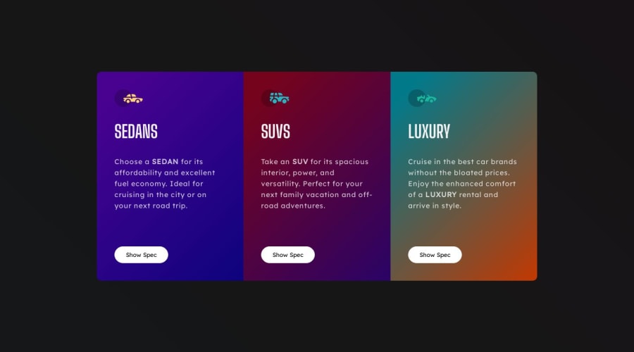
3-column preview card component | React | CSS | Add some modification
Design comparison
Solution retrospective
Hi guys, I just want to share that I have accomplished the 3-column preview card component. So far, so good! It has been enjoyable and fun to work on, especially because I made some modifications to the background colors, hover effects, and animations. That's all! Happy coding, everyone, and mabuhay!
Community feedback
- @FluffyKasPosted over 1 year ago
Heyo,
It's really nice to see a unique take on the challenge, well done :) That being said, I'd make a few suggestions where you could perhaps improve.
I'd remove the opacity animation from the card background, it's not super pleasant for the eyes to see that flickering from opacity 0. Also the background doesn't return to it's original state even after you click on the "Hide Spec" option (the image stays). Maybe it's how it's intended to work, its just not what I was expecting.
There's also a small issue with the responsiveness, if you check your solution around 800px, it has an overflow. Maybe you need to adjust the breakpoint a bit to fix this.
Few words about React best practices:
Usually folders are written lowercase (components, pages, styles, etc). Also, usually each component and page has its own folder. So for example, let's say you want to make a button component. This would live inside a "components" folder, and inside that, there would be a "button" folder with Button.jsx.
In a somewhat larger project it's also nice idea to use something like Sass, so you could include specific styles for each component. Like, in the above mentioned button folder, there could be a Button.scss file as well, with the unique styles belonging to Button.jsx. Apart from unique styles, you can obviously have a styles folder that contains general styles (typography, variables, etc).
There is no need to do this:
import React from "react"; const [hoverCar, setHoverCar] = React.useState(false);
You should instead do specific named imports:
import { useState } from from 'react'; const [hoverCar, setHoverCar] = useState(false);
This isn't so React-specific, but I thought its worth mentioning it: conventionally, classnames should be lowercase too. For example, "Card-Wrapper" should be just "card-wrapper".
Apart from these, I think you did a good job and it's nice to see you put so much effort in it. Keep up the good work ^^
Marked as helpful3@AkoToSiJeromeEhPosted over 1 year ago@FluffyKas, I appreciate that feedback. I'm just new to React, and I will apply what you said in my next work. Thanks!
0 - @Dng120696Posted over 1 year ago
when a designer become a web developer :) haha nice style and animation man ,hope soon im gonna learn react too . but now im still focusing JS
1@AkoToSiJeromeEhPosted over 1 year ago@Dng120696, I appreciate that, man. I'm still learning JavaScript too , but I'm so curious about what is behind in React , so I decided to dive a little into it. Thanks for your feedback again . Mabuhay!
0 - @yssachiPosted over 1 year ago
Great Work!👏 probably this is one of my favorite works that you've done, I really love the changes/modifications you made here✨, as I always said keep striving to achieve your dreams love love
1 - @momin-riyadhPosted over 1 year ago
It could be better in terms of transition and animation smoothness! You should focus on scrimba courses and practice more and follow other developer code
Moreover, you need to subscribe, and to get started, follow this link. It'll take you to the course's website, where you can sign up and start your JavaScript learning journey. Don't worry; the beginner-friendly system is designed to help you grasp the fundamentals.
0
Please log in to post a comment
Log in with GitHubJoin our Discord community
Join thousands of Frontend Mentor community members taking the challenges, sharing resources, helping each other, and chatting about all things front-end!
Join our Discord