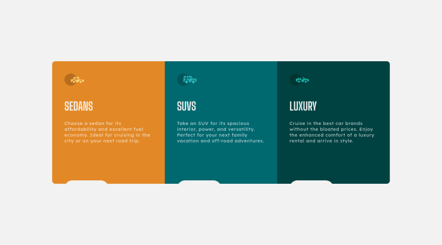
Responsive project using CSS Grid and RWD techniques


Design comparison

Solution retrospective
Hi, That's my second project using RWD, and first one using CSS Grid. I don't really know how to set border-radius to .main_container without setting overflow:hidden. Without overflow:hidden; the border-radius isn't working, but because of overflow: hidden my cards are missing on lower resolutions. Thanks for feedback!
Community feedback
- @MelvinAguilarPosted almost 2 years ago
Hi there 👋. Good job on completing the challenge ! I have some feedback for you if you want to improve your code.
Answering your question:
...because of overflow: hidden my cards are missing on lower resolutions
- Setting a defined
heightfor the component is not recommended. The content should define the component height, otherwise, it will not be allowed to extend beyond your specifications or your content will be cut off if you useoverflow: hidden, Also, setting element height with percentages or VH will cause your component to behave weirdly on mobile devices and high-resolution desktops.
.main_container { /* height: 50%; */ }- Use
min-height: 100vhinstead ofheight: 100vh. Theheightproperty will not work if the content of the page grows beyond the height of the viewport.
HTML:
- You should use only one
<h1>tag per page. The<h1>tag is the most important heading tag, This can confuse screen reader users and search engines. This challenge requires thatSedans,SUVsandLuxuryare headings, but you can use the<h2>tag instead of the<h1>tag. You can read more about this here.
- You should use the
<a>tag instead of the<input>tag because theLearn Moreinput is a link to another page.
- Not all images should have alt text. Car icons are for decoration purposes only, so they can be hidden from screen-readers by adding
aria-hidden="true"and leaving its alt attribute empty:
<img src="./images/icon-sedans.svg" alt aria-hidden="true"> <img src="./images/icon-suvs.svg" alt aria-hidden="true" > <img src="./images/icon-luxury.svg" alt aria-hidden="true" >CSS:
- Instead of using pixels in font-size, use relative units like
emorrem. The font-size in absolute units like pixels does not scale with the user's browser settings. This can cause accessibility issues for users who have set their browser to use a larger font size. You can read more about this here.
- The
width: 100vwproperty in thebodytag is not necessary. Thebodytag is a block element and it will take the full width of the page by default.
I hope you find it useful! 😄 Above all, the solution you submitted is great!
Happy coding!
Marked as helpful1@Jakub-GryczkaPosted almost 2 years ago@MelvinAguilar Thanks so much for feedback! I am just starting and your tips are very helpful. Again, thank you!
1 - Setting a defined

Please log in to post a comment
Log in with GitHub
Join our Discord community
Join thousands of Frontend Mentor community members taking the challenges, sharing resources, helping each other, and chatting about all things front-end!
Join our Discord