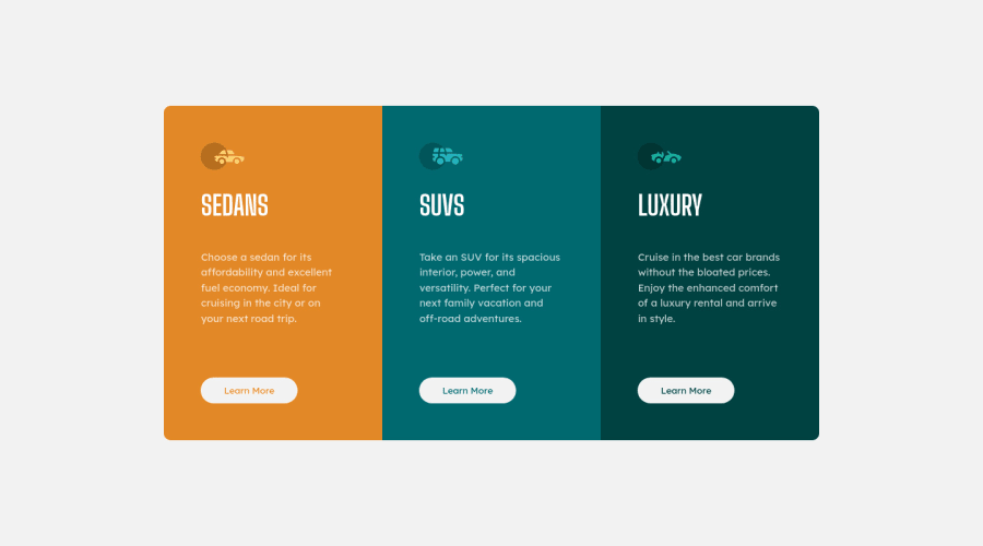
Design comparison
Solution retrospective
Had a lot of fun while building this!
Just wanted to know that is there any better way to set the color of the text on the button (which reads 'Learn More') than what I did. I basically set the color of the three buttons manually but I was wondering if there is any better way to do it?
Of course, any other suggestions and improvements are also welcome :)
Thanks.
Community feedback
- @correlucasPosted about 2 years ago
👾Hello @arnav-luhadiya, Congratulations on completing this challenge!
Great code and great solution! I’ve few suggestions for you that you can consider adding to your code:
- The html structure entirely with
div blocks
but these div doesn't any semantic meaning, for this reason is better you use a better html markup improving your code, for example for each vehicle card you use<article>
instead of the<div>
. - The icon doesn’t have an important role when you think about semantics and the html structure. So you can add
aria-hidden=“true”
to avoid it being found and read in the accessibility mode/screen readers. These are only decorative items. - Think about using relative units as
rem
orem
instead ofpx
to improve your performance by resizing fonts between different screens and devices. Anyhow, if we want a more accessible website, then we should use rem instead of px. REM does not just apply to font size, but to all sizes as well.
✌️ I hope this helps you and happy coding!
Marked as helpful1 - The html structure entirely with
- @karliaskPosted about 2 years ago
Looks great! and it's even responsive! Although not necesary in any way, using transition on hover on the "Learn more" buttons would make it smoother. Nice Job!
0
Please log in to post a comment
Log in with GitHubJoin our Discord community
Join thousands of Frontend Mentor community members taking the challenges, sharing resources, helping each other, and chatting about all things front-end!
Join our Discord