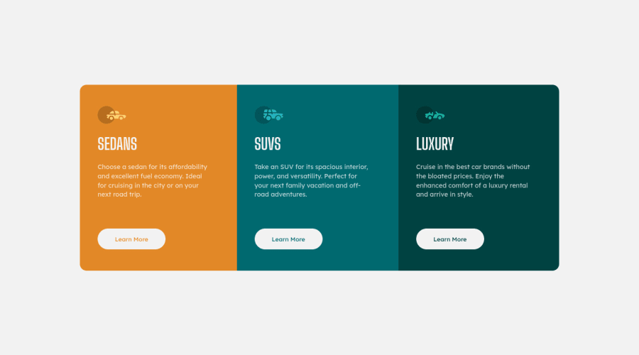
3-Column Preview Card Component (Mobile-First Approach + Flexbox)
Design comparison
Solution retrospective
- I would be happy to receive comments, criticism, and such that could improve the website:
- Cleaner Code
- Better Practice/Approach to making this website.
I struggled a bit with how to make containers responsive (efficiently ) that I could reduce the adjustment and use of media queries.
Community feedback
- @Owczarek-KamilPosted over 1 year ago
Hello,
I am a newbie myself, so do not take my words for granted, but you should not nest buttons and <a> tags together (this also have been pointed out in the FrondEndMentor Accessibility report and HTML validation report). In this case, in my opinion you should go with <a> tags and style them with pseudo classes like, :link, :active, :hover, :visited.
Also, one can argue whether you should put 'alt' on the icons. For me, those icons do not represent any UX purpose - their purpose is decorative one. In such case, alt should be left blank, and you should include aria-hidden="true".
And last but no least, next time try to implement some hover animations on buttons/links. Right now the transition is instant and it is not very pleasing for the eyes :)
Simple transition: all 300ms; would do the work.
Hope you find my comments useful and like I said, do not take my words for granted :)
Happy Coding!
Marked as helpful1@Iron-MarkPosted over 1 year ago@Owczarek-Kamil
Your suggestion has been noted and I am grateful for your input. Thank you for taking the time to share your reviews with me.
0 - @VCaramesPosted over 1 year ago
Hey there! 👋 Here are some suggestions to help improve your code:
- DO NOT FORGET ⚠️ to check your FEM report (It provides value information), to see what is incorrect and update your code with it. This should be done immediately after submitting your challenge.
- The
section
element is being used incorrectly ⚠️ and not needed for this challenge .
- The “car icons” in this component are purely decorative⚠️. Their
alt tag
should be left blank to remove them from assistive technology.
More Info:📚
https://www.w3.org/WAI/tutorials/images/
- Your "buttons" were created with the incorrect element ❌. When the user clicks on the button they should be directed to a different part of you site. The
anchor tag
will achieve this.
More Info:📚
- There is no need to have separate stylesheets ❌, as it can affect site performance. Instead have one single stylesheet ✅.
If you have any questions or need further clarification, you can always check out my submission and/or feel free to reach out to me.
Happy Coding! 👾
Marked as helpful1@MelvinAguilarPosted over 1 year ago@vcarames Hello!! One small thing: The link to your GitHub profile on this platform is linked to your old username, so some people who search for your profile may not find it. You can update it in settings.
0@VCaramesPosted over 1 year ago@MelvinAguilar
That was the first place I checked when I updated my username…. Unfortunately, there is no option to change my username in the FEM setting so it’ll continuously say "vcarames".
0@MelvinAguilarPosted over 1 year ago@vcarames I was referring to the link that appears below the points,screenshot but you already fixed it. Regards.
0@Iron-MarkPosted over 1 year ago@vcarames
Can you further specify how <section> element is being used incorrectly, and how can it be used correctly?
Thank you so much for your valuable suggestion. I truly appreciate your support.
0@VCaramesPosted over 1 year ago@Iron-Mark
Glad I could help!
You are using it to wrap each individual card in a
section
element instead of using adiv
. Thesection
element is meant group related content in full sites. They are not meant to contain small things like you did.If this was part of a real site, the entire thing would be wrapped in a
section
and it will have anh2
heading saying something like "Check out our models..."Marked as helpful1
Please log in to post a comment
Log in with GitHubJoin our Discord community
Join thousands of Frontend Mentor community members taking the challenges, sharing resources, helping each other, and chatting about all things front-end!
Join our Discord