Design comparison
Solution retrospective
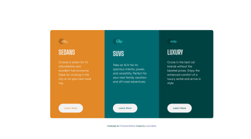
So, in this project I tried to use grid to create the cards in screens with min width 768px. But for me it was hard because I'm not very used to use grid, and the size of the containers are overtaking the other sometimes! If you guys could give me some tips, I'll be very happy.
Other problem that if was struggling with, was to place the button always in the bottom of the container!
Community feedback
- @VCaramesPosted almost 2 years ago
Hey there! 👋 Here are some suggestions to help improve your code:
- The “car images/icons” in this component are purely decorative; They add no value. So their
Alt Tag
should be left blank and have anaria-hidden=“true”
to hide them from assistive technology.
More Info:📚
https://www.w3.org/WAI/tutorials/images/
- The “SEDANS”, “SUVS” and “LUXURY” are headings so they need be wrapped in a heading element. Since each heading in this card has the same level of importance an
h2
heading will be the best choice.
- Your "buttons" were created with the incorrect element. When the user clicks on the button they should be directed to a different part of you site. The
anchor tag
will achieve this.
More Info:📚
If you have any questions or need further clarification, feel free to reach out to me.
Happy Coding!🎄🎁
Marked as helpful0 - The “car images/icons” in this component are purely decorative; They add no value. So their
- @0xabdulPosted almost 2 years ago
Well your project is nice and mobile responsive is also nice but some problem in your project Solution Img { Padding : 30px; }
.main__title{ Padding : 30px ; } Padding uses give the gap of the contents...
I hope it's helpful for you
“Peace be upon you and God's mercy and blessings.”
1
Please log in to post a comment
Log in with GitHubJoin our Discord community
Join thousands of Frontend Mentor community members taking the challenges, sharing resources, helping each other, and chatting about all things front-end!
Join our Discord