Not Found
Not Found
Not Found
Not Found
Not Found
Not Found
Not Found
Not Found
Not Found
Not Found
Not Found
Not Found
Not Found
Not Found
Not Found
Not Found
Not Found
Not Found
Not Found
Not Found

Submitted

CSS flexbox

@marianarainha

Desktop design screenshot for the 3-column preview card component coding challenge

This is a solution for...

  • HTML
  • CSS
1newbie
View challenge

Design comparison


SolutionDesign

Solution retrospective


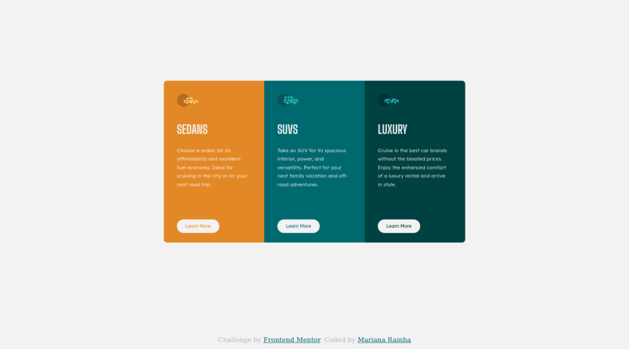
I couldn't figure it out how to set different borders radius to the cards when they'are wrapped so it can look like the mobile-design. Should I use @media ? How ?

Community feedback

@VCarames

Posted

Hey there! 👋 Here are some suggestions to help improve your code:

  • The “car images/icons” in this component are purely decorative; They add no value. So their Alt Tag should be left blank and have an aria-hidden=“true” to hide them from assistive technology.

More Info:📚

https://www.w3.org/WAI/tutorials/images/

  • The headings in your component are being used incorrectly. Since the h1 heading can only be used once, it is always given to the heading with the highest level of importance. This component has three headings of equal importance, so the best option would be to use an h2 heading since it is reusable and it will give each heading the same level of importance.

If you have any questions or need further clarification, feel free to reach out to me.

Happy Coding!🎄🎁

Marked as helpful

0

@marianarainha

Posted

@vcarames thank you very much for your feedback ! I’ll make all those improvements.

0

@VCarames

Posted

@marianarainha

I am glad that I was able to help out!

Keep it up!

0

@ksrogue

Posted

Hello, on my project I used border-radius in my main cards div with a 'overflow: hidden;'.

I think you can use 'border-top-left/right-radius' on the first card and border-bottom-left/right-radius' on the last card too

Marked as helpful

0

@marianarainha

Posted

@ksrogue thank you, i'll take a look

0

Account Deleted

/* How can I set different borders radius when the cards are wrapped so it can look like the mobile-design ? Should I use @media ? How ? * You can use the clamp function on css checkout from mdn or use the responsive parameters like vw for border-radius value

Marked as helpful

0

@marianarainha

Posted

@GorkemEldeniz Thank you, i'll check it out !

1

@SinisaVukmirovic

Posted

Hello!

Hey, border is, actually, a shorthand way of declaring it. Border radius can, actually, take in 4 values. A different one for each corner if you want.

border-top-left-radius
border-top-right-radius
border-bottom-right-radius
border-bottom-left-radius

or shorter

/* top-left | top-right | bottom-right | bottom-left */
border-radius: 1px 0 3px 4px;

Here, check it out in the documentation

Hope this helps!

0

@marianarainha

Posted

@SinisaVukmirovic Thank you for your answer but the question is how to make it responsive so it changes when the cards are wrapped.

0

@SinisaVukmirovic

Posted

@marianarainha

You would set one value combination for mobile view, and another value combination for desktop view in media queries.

Marked as helpful

0

@marianarainha

Posted

@SinisaVukmirovic thank you very much, now it works :)

0

Please log in to post a comment

Log in with GitHub
Discord logo

Join our Discord community

Join thousands of Frontend Mentor community members taking the challenges, sharing resources, helping each other, and chatting about all things front-end!

Join our Discord