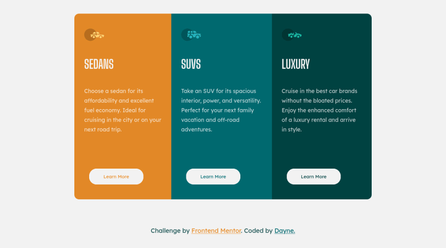
Design comparison
Solution retrospective
I had a bit of trouble with this project, because I was making a mistake of using explicit heights and bloated my code with too many classes. Thanks to Grace from slack for pointing it out, I streamlined it as best I know.
Any other things I need to to better, any feedback is always welcome.
Community feedback
- @VCaramesPosted almost 2 years ago
Hey there! 👋 Here are some suggestions to help improve your code:
- Along with the blank
alt tag, you also want to include thearia-hidden=“true”to your “car images/icons” to fully remove them from assistive technology.
More Info:📚
https://www.w3.org/WAI/tutorials/images/
- The “SEDANS”, “SUVS” and “LUXURY” are headings so they need be wrapped in a heading element. Since each heading in this card has the same level of importance an
h2heading will be the best choice.
- Your "buttons" were created with the incorrect element. When the user clicks on the button they should be directed to a different part of you site. The
anchor tagwill achieve this.
More Info:📚
If you have any questions or need further clarification, feel free to reach out to me.
Happy Coding!🎄🎁
Marked as helpful1@Dayne2xPosted almost 2 years ago@vcarames Hello, thanks for your input. I have made the suggested changes, the project remains without issues. I will keep your suggestions in minds as I work on future projects.
0 - Along with the blank
Please log in to post a comment
Log in with GitHubJoin our Discord community
Join thousands of Frontend Mentor community members taking the challenges, sharing resources, helping each other, and chatting about all things front-end!
Join our Discord
