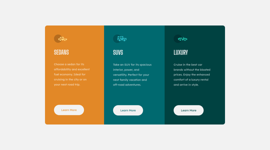
3-Column Preview Card Component | HTML5 & CSS3 (Flexbox)
Design comparison
Solution retrospective
Any suggestion for improvement are greatly appreciated.
Community feedback
- @FluffyKasPosted about 3 years ago
Hey, great solution! You even added your readme, very nice :) Something that perhaps you could improve is your html. Switch your container
div
tomain
, that gets rid of the issue in the accessibility report. The other thing is your image alts. They have a specific role to fill, I'd suggest reading this, it was a game-changer for me: (https://axesslab.com/alt-texts/) In this challenge, I believe they can be just left empty, but I still suggest reading this great article for future projects! :)Marked as helpful0@syzwnftrPosted about 3 years ago@FluffyKas Hi, thanks for your feedback. And yeah, you're right! I need to improve my html. I've been dealing with the accessibility issue since my first challenge and I just turn a blind eye on it. Perhaps this is the right time to learn more about accessibility, and apply it on my next challenge. I'll be sure to check out those link that you suggested. Cheers! :)
0@FluffyKasPosted about 3 years ago@syzwnftr Accessibility is a big and complicated topic. I'm still learning it myself but taking it step by step helps ^^ After all, you can always return to older projects and correct them a bit :) Good luck!
0
Please log in to post a comment
Log in with GitHubJoin our Discord community
Join thousands of Frontend Mentor community members taking the challenges, sharing resources, helping each other, and chatting about all things front-end!
Join our Discord