3-column preview card component / flexbox / grid / SCSS /
Design comparison
Solution retrospective
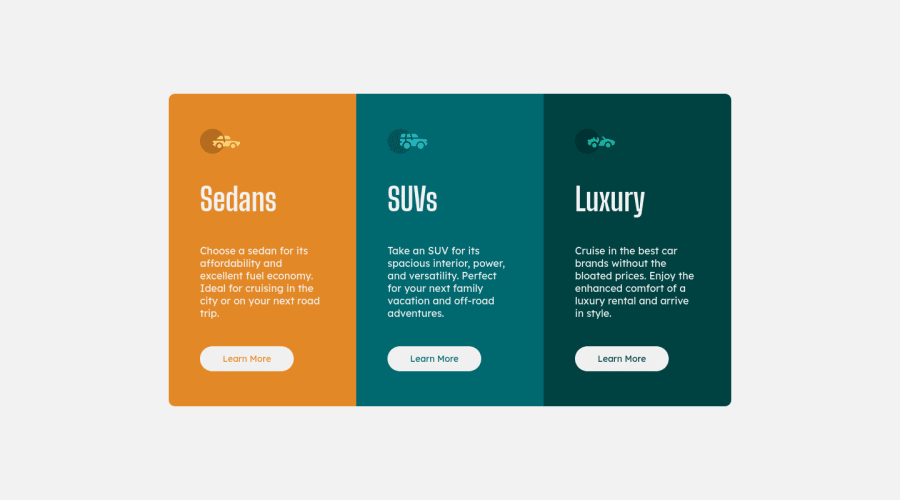
I tried using flexbox for initial positioning and grid for the card. I used sass as my pre-procesor of choice. My main goal was to make it a simple as possible, any observation is highly appreciated.
Please log in to post a comment
Log in with GitHubCommunity feedback
- @sephorus
Hi Rodrigo,
Nice work on this challenge! I just completed this one as well. I have some feedback that I think would help your solution match the design files just a little bit better:
-
I would add some line-height to the descriptions of the cards! 30px seemed to work for me.
-
All of the car titles (SUVs, Luxury, and Sedans) are all uppercased in the design files. Use some text-transform: uppercase; on your titles to make it match!
-
Very small margin changes - I would add more of a margin between the button and the description, and decreased the margin between the title and the paragraph.
-
The active states of the buttons I think have been missed. The previous comment ^ seemed to mention something about this.
-
This is also super picky, but thought I would mention it anyway. The text on the cards in the design files looks a little bit faded. I would play around with the opacity to try and match it.
Overall, good job! You can check mine out here if you'd like: https://sephorus.github.io/three-column-challenge/
Marked as helpful -
- @ogabak
your card looks like the one provided and your code was readable for me, but I think you missed one part of the hover action. When you hover over the learn more button, it is supposed to inherit the color of the card it is made for. once that is implemented, I your solution would be good.
Marked as helpful - @vanzasetia
👋Hi Rodrigo Alas!
For styling I recommend to use classes for everything rather than using
id, since it will increase the specificity unnecessarily.Use
idfor navigation of the page instead. Like to move down to a certain part of your page.<a href="#article">Read More</a>That's it! Hopefully this little tip might be useful for you!
Join our Discord community
Join thousands of Frontend Mentor community members taking the challenges, sharing resources, helping each other, and chatting about all things front-end!
Join our Discord
