Not Found
Not Found
Not Found
Not Found
Not Found
Not Found
Not Found
Not Found
Not Found
Not Found
Not Found
Not Found
Not Found
Not Found
Not Found
Not Found
Not Found
Not Found
Not Found
Not Found

Submitted

3-column-preview-card-component-main

Matthewβ€’ 380

@matthew-marco

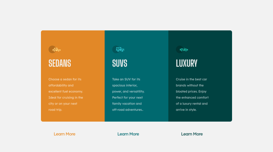
Desktop design screenshot for the 3-column preview card component coding challenge

This is a solution for...

  • HTML
  • CSS
1newbie
View challenge

Design comparison


SolutionDesign

Solution retrospective


why in the mobile media when I decrease the height for the container it do a gap from the top only not divide by the top and bottom

Community feedback

@MelvinAguilar

Posted

Hi there πŸ‘‹. Good job on completing the challenge ! I have some feedback for you if you want to improve your code.

The space above the component and not below it is because the entire component is overflowing. You can check this by choosing "overflow: hidden;" in the select "container" and you can see how the component will be centered.

  • Setting a defined height for the component is not recommended. The content should define the component height, otherwise, it will not be allowed to extend beyond your specifications.
  • Setting the width of the component with a percentage or a viewport unit will behave strangely on mobile devices or large screens. You should use a max-width of 920px to make sure that the component will have a maximum width of 920px on any device, also remove the width property with a percentage value.

HTML:

  • You should use only one <h1> tag per page. The <h1> tag is the most important heading tag, This can confuse screen reader users and search engines. This challenge requires that Sedans, SUVs and Luxury are headings, but you can use the <h2> tag instead of the <h1> tag. You can read more about this here.
  • You should use the <a> tag instead of the <button> tag because the Learn More button is a link to another page. Use buttons to perform actions like submitting a form or closing a modal and use links to navigate to another page. You can read more about this here.
  • Not all images should have alt text. Car icons are for decoration purposes only, so they can be hidden from screen-readers by adding aria-hidden="true" and leaving its alt attribute empty:
<img src="./images/icon-sedans.svg" alt aria-hidden="true">
<img src="./images/icon-suvs.svg" alt aria-hidden="true" >
<img src="./images/icon-luxury.svg" alt aria-hidden="true" >

I hope you find it useful! πŸ˜„ Above all, the solution you submitted is great!

Happy coding and Happy New Year! πŸŽ‰πŸŽŠπŸŽ

Marked as helpful

2

Matthewβ€’ 380

@matthew-marco

Posted

@MelvinAguilar thx so much for your help but why should I remove the precentage width I did that to make the P and the button have a fixed width to get the same shape as in the design pic also I am uploading some changes that You and Hassia Issah told me to do If you wanna see it

0

@MelvinAguilar

Posted

@matthew-marco Hi! I expressed myself wrong, you should eliminate the width with percentage or vw in the main class="container" container, because on large screens it looks too big, although there are people who also recommend using the "ch" unit to define a width for text elements like paragraphs.

Marked as helpful

1
Matthewβ€’ 380

@matthew-marco

Posted

@MelvinAguilar okay i will try that and give you the updates

0
Hassia Issahβ€’ 50,650

@Hassiai

Posted

Give .container a fixed width value instead of a percentage width value. e.g width: 38rem; There is no need to give .container a height value. Give the cards the same padding value for all the sides, this will be sufficient.

.container{
width: 38rem;
display: flex;
}
.card_one, .card_two, .card_three{
padding: 3.5rem;
}

In the media query , there is no need to give .container a heigh value, replace the width value with max-width for the content to be responsive on the screens that you specified

.container{
max-width: 35rem;
flex-direction: column;
}

Hope am helpful.

Well done for completing this challenge. HAPPY CODING

Marked as helpful

1

Matthewβ€’ 380

@matthew-marco

Posted

@Hassiai thx so much for your help but why should I give padding 3.5rem it did not do any change

1
Hassia Issahβ€’ 50,650

@Hassiai

Posted

@matthew-marco the 3.5rem was my suggestions you can increase it .

Marked as helpful

1
Matthewβ€’ 380

@matthew-marco

Posted

@Hassiai no I do not mean the number i mean it didn't change anything when i give padding

0
Hassia Issahβ€’ 50,650

@Hassiai

Posted

@matthew-marco pleas do what works for you :)

0

Please log in to post a comment

Log in with GitHub
Discord logo

Join our Discord community

Join thousands of Frontend Mentor community members taking the challenges, sharing resources, helping each other, and chatting about all things front-end!

Join our Discord