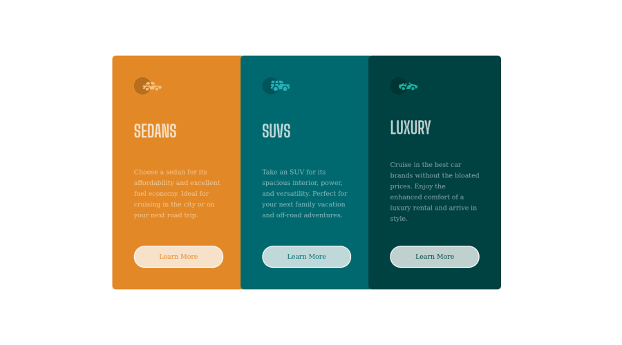
Design comparison
SolutionDesign
Community feedback
- @HassiaiPosted almost 2 years ago
Replace <div class="container"> with the main tag and <h2> with <h1> to fix the accessibility issues. for more on semantic html visit https://web.dev/learn/html/semantic-html/
Reduce the padding value of a e.g: padding: 1rem 2.5rem; give it a background color of transparent white. What you did for a is for a:hover. There is no need to give the body width: 100vw; replace height:100vh with min-height:100vh;
Hope an helpful.
Happy Coding
Marked as helpful1@HassiaiPosted almost 2 years ago@alexeightsix if my comment was helpful, mark it as helpful
0
Please log in to post a comment
Log in with GitHubJoin our Discord community
Join thousands of Frontend Mentor community members taking the challenges, sharing resources, helping each other, and chatting about all things front-end!
Join our Discord
