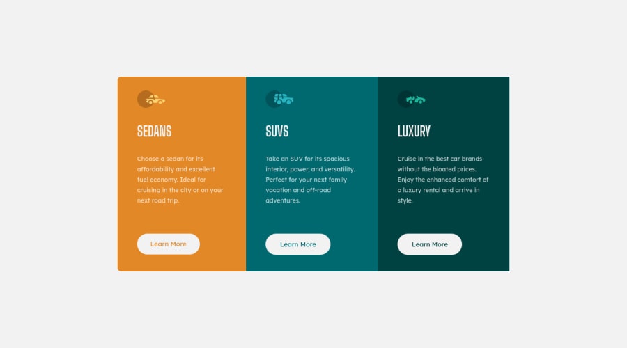
Design comparison
SolutionDesign
Solution retrospective
Feedback will be appreciated :)
Community feedback
- @darryncodesPosted about 3 years ago
Hi Ali,
Awesome solution, really well done!
- I noticed the border-radius is not showing on one side of the design, you could add
overflow: hidden;to.containerto resolve this - Your buttons are jumping slightly, this is because you're adding the border on hover. Try swapping it to before the hover to fix it
- I wondered if you considered switching the design to a column for the mobile view. You could use
flex-direction: column;and a media query
You might find these resources useful:
- A Complete Guide to Flexbox - css tricks
- Learn Flexbox for free - Scrimba
- Responsive Web Design - freeCodeCamp
All the best!
Marked as helpful1 - I noticed the border-radius is not showing on one side of the design, you could add
Please log in to post a comment
Log in with GitHubJoin our Discord community
Join thousands of Frontend Mentor community members taking the challenges, sharing resources, helping each other, and chatting about all things front-end!
Join our Discord
