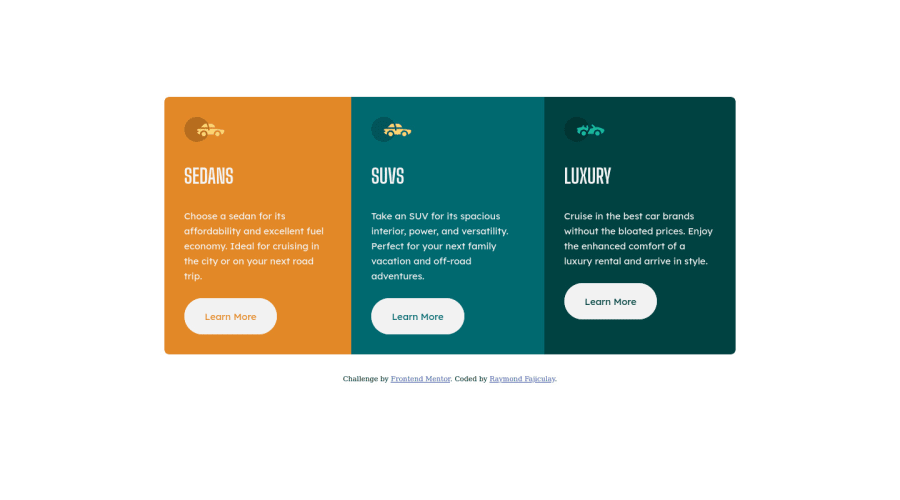
Design comparison
Solution retrospective
Hi! I would appreciate it if you could review my code and give feedback. Your feedback is very important to me, thank you very much!!!
Community feedback
- @vanzasetiaPosted about 2 years ago
Hi again, Raymond! 👋
Awesome work on this challenge! Your solution is responsive and looks great! 👍
I have some suggestions for improvements.
- Swap all the
h1withh2. It is not a best practice to have manyh1on a page. It can confuse the screenreader users because there will be many titles for a single page. I recommend reading the "How-to: Accessible heading structure - The A11Y Project" article to learn how to use headings correctly. - Always specify the
typeof thebutton. In this case, set the type of them astype="button". It will prevent the button from behaving unexpectedly.
Overall, it's a good solution. For your information, it is possible to make this site responsive without any media queries. I managed to do it on my solution.
I hope this helps! Keep up the excellent work! 👍
Marked as helpful2 - Swap all the
- @correlucasPosted about 2 years ago
👾Hello @keyztrokee, Congratulations on completing this challenge!
Great code and great solution! I’ve few suggestions for you that you can consider adding to your code:
1.Use
max-width: 100%for the cards in the mobile version to allow the cards grow 100% of the width considering the paddings and avoid to have a lateral gap (limited by a fixed width).2.Your solution seems fine, you did a really good job wrapping the content for these 3 cards. Something you can improve here is to use a
single classto manage the content that is mostly the same for the 3 cards (paddings, colors, margins and etc) and another class to manage the characteristics that are different (colors and icon), this way you'll have more control over then and if you need to change something you modify only one class.✌️ I hope this helps you and happy coding!
Marked as helpful1 - @VCaramesPosted about 2 years ago
Hey @keyztrokee, adding to what was said above/below:
- To give you HTML code structure, you want to set up your code in the following manner (only did parent containers):
  <body>
      <main>
        <article>
          <article class="sedan-card"></article>
          <article class="sedan-card"></article>
          <article class="luxury-card"></article>
        </article>
      </main>
    </body>
The Main Element identifies the main content of the document.
While the Article Element will serve as the card’s container, because the card represents a complete, or self-contained, section of content that is, in principle, independently reusable.
Lastly, each card will be wrapped in their own Article Element because they too, are complete, or self-contained, section of content that is, in principle, independently reusable.
More info:
https://web.dev/learn/html/headings-and-sections/
- Your "buttons" were created with the incorrect element. When the user clicks on the button they should directed to a different part of you site. The Anchor Tag will achieve this.
Happy Coding! 👻🎃
Marked as helpful1 - @OUSSAMAACHICHEPosted about 2 years ago
Hi reymond this is a good job you can use semantic html it is the best way
1
Please log in to post a comment
Log in with GitHubJoin our Discord community
Join thousands of Frontend Mentor community members taking the challenges, sharing resources, helping each other, and chatting about all things front-end!
Join our Discord
