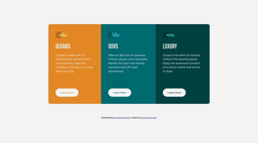
Design comparison
Solution retrospective
The project took me less than 2 hours to complete
Community feedback
- @Islandstone89Posted 9 months ago
Good advice from @Zukizuk. Here are some additional suggestions.
HTML:
-
"Learn More" would navigate to another page, hence it is not a button but a link.
-
Footer text must be wrapped in a
<p>.
CSS:
-
Performance-wise, it's better to link fonts in the
<head>of the HTML than using@import. -
It's good practice to include a CSS Reset at the top.
-
On the
body, changeheighttomin-height- this way, the content will not get cut off if it grows beneath the viewport. -
Remove the
margin-topon the card container, it is not needed. -
max-widthon card container should be in rem. -
The individual cards should not have a
max-width. -
font-sizemust never be in px. This is bad for accessibility, as it prevents the font size from scaling with the user's default setting in the browser. Use rem instead. -
Media queries should be in rem, and it is common to do mobile styles as the default. This means having
flex-direction: columnon the card container, and when there is room for the layout to change, switch toflex-direction: row.950pxdoesn't seem like the ideal breakpoint to me - I would try something around650px, which equals to around40rem.
2@fryca9Posted 9 months ago@Zukizuk, @Islandstone89 thank you very much for your feedback. I've applied most of your tips. I didn't know that CSS reset makes that much difference ;). When I was cleaning my code and checking the responsiveness of my web page, I noticed that on certain screen dimensions, the "learn more" buttons are not aligned vertically. I tried to devise a solution but it didn't work out. If you could take one more glance at my code, I'd really appreciate it. Thank you!
1@ZukizukPosted 9 months ago@fryca9 Is it the slight shift of the button when it's around 650px width? If so, you may have to write styles for that breakpoint or you may as well use it to do the tablet version of this challenge. But in this particular challenge I don't think it should be a problem since tablet design wasn't provided.
It seems to be shifting because they don't all have the same amount of text. You can try grouping the images, headings and text in a div to separate it from the button and use
display: grid;on the cards, usegapto specify their spaces instead of margins. Try that and let see what you get.0 -
- @ZukizukPosted 9 months ago
Hello there, Congratulations on completing this project
Your solution looks nice
I have few suggestions that I think might be of interest to you.
The heading elements are H1, H2, H3, H4, H5, and H6 with H1 being the highest (or most important) level and H6 the least. Only use one
<h1>per page - this should represent the main heading/subject for the whole page. Also, do not skip heading levels - start with<h1>, then use<h2>, and so on. The heading elements are H1, H2, H3, H4, H5, and H6 with H1 being the highest (or most important) level and H6 the least. In your code I didn't see any h1 tag but h3 which is wrong so consider fixing that.In this challenge for example, there's no text that can serve as an appropriate content for h1 tag so in this situation you do something like this
<h1 class="sr-only">3-column-preview-card-component</h1>and in the css, you hide the h1 with the help ofposition: absolute;to hide it from view. The H1 is needed for accessibility and seo so you need it in every page. You can read more about that here heading element.If there's no text in your page to serve as the h1 tag, provide one yourself which can best serve as subject/ main heading of the page and hide it with
position: absolute;I hope this feedback is helpful
Other than that great job
2
Please log in to post a comment
Log in with GitHubJoin our Discord community
Join thousands of Frontend Mentor community members taking the challenges, sharing resources, helping each other, and chatting about all things front-end!
Join our Discord
