Not Found
Not Found
Not Found
Not Found
Not Found
Not Found
Not Found
Not Found
Not Found
Not Found
Not Found
Not Found
Not Found
Not Found
Not Found
Not Found
Not Found
Not Found
Not Found
Not Found

Submitted

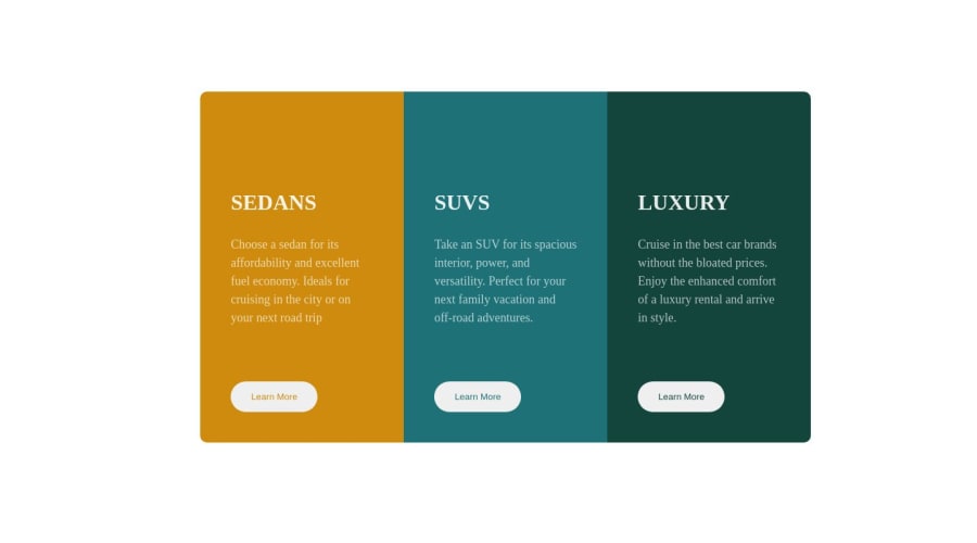
3-column preview card component design using html & css

@Supber909

Desktop design screenshot for the 3-column preview card component coding challenge

This is a solution for...

  • HTML
  • CSS
1newbie
View challenge

Design comparison


SolutionDesign

Community feedback

@sliyarli

Posted

You've created a nice-looking 3-column layout with HTML and CSS. Overall, it looks good, but I have a few suggestions to enhance your code:

1 - Semantic HTML: You've used appropriate HTML elements like headings (<h1>), paragraphs (<p>), and buttons (<button>) which is great. However, consider using semantic HTML elements like <section> for each column to improve the structure and make it more accessible.

2 - Accessibility: Ensure that your website is accessible. For instance, you can add alt attributes to your images for screen readers.

3 - Consistency in CSS: While your CSS is organized, try to keep a consistent order in your CSS properties (e.g., always put background-color before padding), which makes it easier to read and maintain.

4 - Responsive Design: Currently, your layout has a fixed width. Consider making it responsive by using relative units like percentages or using CSS media queries to adapt the layout for different screen sizes. This will make your site look good on various devices.

5 - Spacing and Typography: The spacing and typography look good. However, make sure to keep consistent spacing between elements and maintain a good balance of whitespace.

6 - Button Styling: The buttons look fine, but consider adding some hover effects to make them more interactive. For example, you can change the background color or add a subtle shadow when the user hovers over them.

Here's a revised version of your HTML and CSS with some of these suggestions implemented:

<!DOCTYPE html>
<html lang="en">
<head>
    <meta charset="UTF-8">
    <meta http-equiv="X-UA-Compatible" content="IE=edge">
    <meta name="viewport" content="width=device-width, initial-scale=1.0">
    <link rel="stylesheet" href="style.css">
    <title>Challenge</title>
</head>
<body>
    <div class="general">
        <section class="box">
            <img src="images/icon-sedans.svg" alt="Sedans">
            <h1 class="sed">SEDANS</h1>
            <p class="ch">Choose a sedan for its affordability and excellent fuel economy. Ideal for cruising in the city or on your next road trip.</p>
            <button class="learn-more sedans">Learn More</button>
        </section>
        <section class="box">
            <img src="images/icon-suvs.svg" alt="SUVs">
            <h1 class="suv">SUVS</h1>
            <p class="ta">Take an SUV for its spacious interior, power, and versatility. Perfect for your next family vacation and off-road adventures.</p>
            <button class="learn-more suvs">Learn More</button>
        </section>
        <section class="box">
            <img src="images/icon-luxury.svg" alt="Luxury">
            <h1 class="lux">LUXURY</h1>
            <p class="cr">Cruise in the best car brands without the bloated prices. Enjoy the enhanced comfort of a luxury rental and arrive in style.</p>
            <button class="learn-more luxury">Learn More</button>
        </section>
    </div>
</body>
</html>
* {
    padding: 0;
    margin: 0;
    box-sizing: border-box;
}

body {
    background-color: white;
    display: flex;
    justify-content: center;
    align-items: center;
    height: 90vh;
}

.general {
    display: grid;
    grid-template-columns: repeat(3, 1fr);
    max-width: 1200px;
    width: 100%;
    border-radius: 15px;
    gap: 20px;
    padding: 20px;
    margin: 0 auto;
}

.box {
    background-color: #E28524;
    border-radius: 10px;
    padding: 20px;
    display: flex;
    flex-direction: column;
    align-items: center;
    text-align: center;
}

h1 {
    color: rgba(255, 255, 255, 0.899);
    margin-top: 20px;
    font-size: 24px;
}

p {
    color: rgba(255, 255, 255, 0.685);
    margin-top: 10px;
    margin-bottom: 20px;
    line-height: 1.5;
    font-size: 16px;
}

button.learn-more {
    color: white;
    background-color: inherit;
    border: none;
    padding: 15px 30px;
    border-radius: 25px;
    cursor: pointer;
    transition: background-color 0.3s ease;
}

button.learn-more:hover {
    background-color: rgba(255, 255, 255, 0.2);
}

These changes aim to improve the structure, accessibility, and responsiveness of your code while maintaining the visual style you've created.

Marked as helpful

0

@Supber909

Posted

Thank you so much for the feedback @sliyarli, it was really helpful!!!

1

@sliyarli

Posted

don't mention it, good luck! 🙏🏻 @Supber909

Marked as helpful

1

Please log in to post a comment

Log in with GitHub
Discord logo

Join our Discord community

Join thousands of Frontend Mentor community members taking the challenges, sharing resources, helping each other, and chatting about all things front-end!

Join our Discord