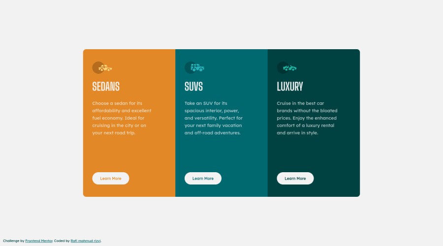
Design comparison
Solution retrospective
Please feel free to share your opinions about my coding. Your comments really help me to improve my skills.
Community feedback
- @correlucasPosted over 2 years ago
👾 Hello Rafi, congratulations for your solution!
Overall your solution is fine, you can do two little fixes to improve it:
1.Set the
@media query
a little later and let the component stretch a little bit more before change the container flow vertically. You can do it around 750px.@media (max-width: 750px) body { overflow-x: hidden; overflow-y: visible; display: block; height: auto; }
2.The padding between the paragraph and button are a little bit too big, see the image reference.
Congrats and happy coding!
Marked as helpful1@RafiiMahmudRiizviiPosted about 2 years ago@correlucas thank you very very much for your suggestion. I am very glad. Big fan of you.
1@correlucasPosted about 2 years ago@RafiiMahmudRiizvii Thanks for the kind words Rafi!
0 - @mubizzyPosted over 2 years ago
good job @RafiiMahmudRiizvii just need need to some features for the card to be in the right position
.container{ align-items: center; justify-content: center; }
Also, you need to work on your accessibility wrap your code in your
<main>
Tag1@RafiiMahmudRiizviiPosted about 2 years ago@mubizzy it is really helpful. i update my code as soon as possible. Thank you very much for your suggestion.
0 - Account deleted
Hey Rafi, congratulations You did a great job 😉
Some little tips for optimizing your code:
- add
main
tag and wrap the card for improve the Accessibility - with
font-family:" Big Shoulders Display ", cursive
the browser will use the Comics Sans font when it doesn't find the first font indicated (you can seen during loading)... really awful font! Replace it with afont-family:" Big Shoulders Display ", sans-serif
much more similar to the primary font - instead of using
height: 100vh
to body usemin-height: 100vh
- instead of using
px
try to use relative units of measurement likerem
-> read here it's much better!
Hope this help! Happy coding 😁 by Travolgi
1 - add
Please log in to post a comment
Log in with GitHubJoin our Discord community
Join thousands of Frontend Mentor community members taking the challenges, sharing resources, helping each other, and chatting about all things front-end!
Join our Discord