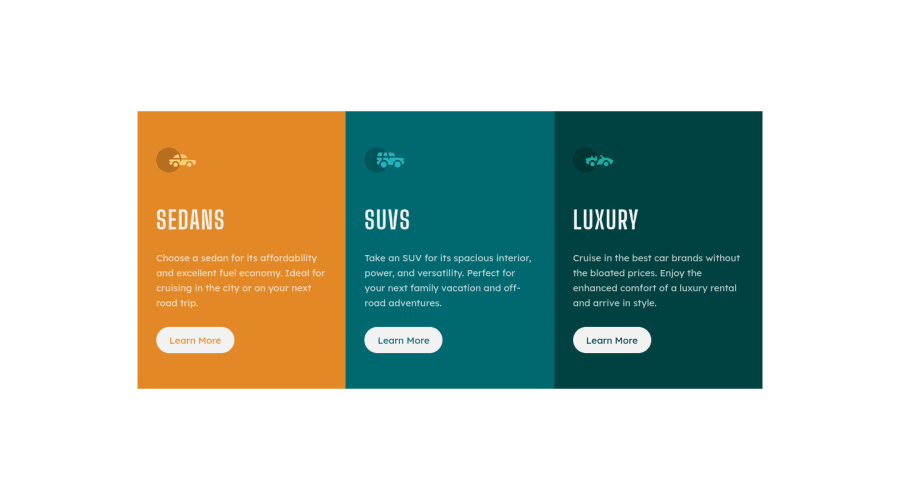
Design comparison
SolutionDesign
Community feedback
- @MelvinAguilarPosted almost 2 years ago
Hi there 👋. Good job on completing the challenge ! I have some feedback for you if you want to improve your code.
HTML:
- Use the
<main>tag to wrap all the main content of the page instead of the<div>tag. With this semantic element you can improve the accessibility of your page.
- You should use only one
<h1>tag per page. The<h1>tag is the most important heading tag, This can confuse screen reader users and search engines. This challenge requires thatSedans,SUVsandLuxuryare headings, but you can use the<h2>tag instead of the<h1>tag. You can read more about this here.
- Not all images should have alt text. Car icons are for decoration purposes only, so they can be hidden from screen-readers by adding
aria-hidden="true"and leaving its alt attribute empty:
<img src="./images/icon-sedans.svg" alt aria-hidden="true">
<img src="./images/icon-suvs.svg" alt aria-hidden="true" >
<img src="./images/icon-luxury.svg" alt aria-hidden="true" >
I hope you find it useful! 😄 Above all, the solution you submitted is great!
Happy coding!
0 - Use the
Please log in to post a comment
Log in with GitHubJoin our Discord community
Join thousands of Frontend Mentor community members taking the challenges, sharing resources, helping each other, and chatting about all things front-end!
Join our Discord
