Submitted over 2 years ago
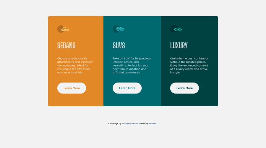
3-column preview card component by Wafferu
@wafferu
Design comparison
SolutionDesign
Solution retrospective
What did you find difficult while building the project?
N/A
Which areas of your code are you unsure of?
Not a code but the accuracy of the layout of the project to this challenge expected layout.
Do you have any questions about best practices?
Same as always, I need a tips on how to accurately layout the site to the expected layout.
Community feedback
Please log in to post a comment
Log in with GitHubJoin our Discord community
Join thousands of Frontend Mentor community members taking the challenges, sharing resources, helping each other, and chatting about all things front-end!
Join our Discord
