Submitted about 1 year ago
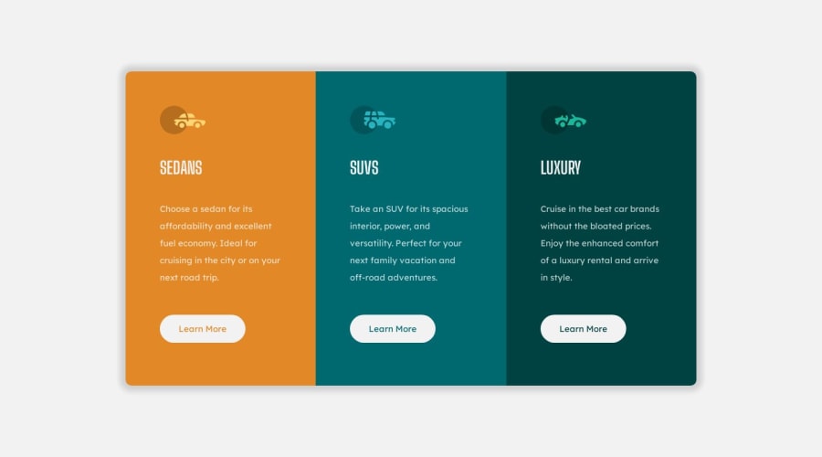
3-column preview card component - Basic HTML/CSS using Grid & Flexbox
@meisteraxel
Design comparison
SolutionDesign
Solution retrospective
Hello! :)
Any tips are appreciated! What should I do better next time? Struggled a little bit with the height Attribute of the body element because Content would cut off after changing from Rows to Columns in the Grid Container.
I do not have Pro, so the Design isn't 100% correct because i do not have access to the Figma Files.
Thanks in advance! Axel :)
Community feedback
Please log in to post a comment
Log in with GitHubJoin our Discord community
Join thousands of Frontend Mentor community members taking the challenges, sharing resources, helping each other, and chatting about all things front-end!
Join our Discord
