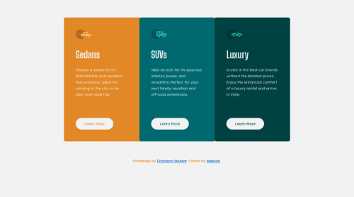
Design comparison
Solution retrospective
Simple component with simple flex-box.
I will be glad if you help me make it better!
Community feedback
- @correlucasPosted about 2 years ago
👾Hello Maksim, Congratulations on completing this challenge!
Great solution and great start! By what I saw you’re on the right track. I’ve few suggestions to you that you can consider to add to your code:
The approach you've used to center this card vertically is not the best way, because using margins you don't have much control over the component when it scales. My suggestion is that you do this alignment with
flexbox
using the body as a reference for the container.The first thing you need to do is to remove the margins used to align it, then apply
min-height: 100vh
to the body to make the child (the card/container) align to its size that now will be displaying 100% of the viewport height and then give its alignment withdisplay: flex
andalign-items: center
/justify-items: center
.body { min-height: 100vh; margin: 0; padding: 0 15px; font-family: 'Lexend Deca', sans-serif; font-size: 15px; background-color: var(--light-gray); color: var(--white); display: flex; flex-direction: column; align-items: center; justify-content: center; } .wrapper { /* margin: 5% auto; */ max-width: 920px; display: flex; flex-wrap: nowrap; border-radius: 8px; background-color: var(--orange); }
The component html structure its fine, something you can do to improve the html markup its to replace some divs, note that you build all the structure using div blocks and these don’t have an particular meaning, for this reason its better you use meaningful tags like
<article>
in this example, for the cards replacing the divs, this way you have a tag that describes what it's inside the this html block.✌️ I hope this helps you and happy coding!
Marked as helpful0 - @JorggyhPosted about 2 years ago
@MaxTarasevich good job, if you accept two suggestions:
- try to apply
border-radius
only in the first and last cards. - try to apply the same
hover
effect on buttons when infocus
(when pressing TAB) or showoutline
otherwise accessibility is impaired.
If you have difficulty let me know, first I think it's important that you try to solve it yourself.
0 - try to apply
Please log in to post a comment
Log in with GitHubJoin our Discord community
Join thousands of Frontend Mentor community members taking the challenges, sharing resources, helping each other, and chatting about all things front-end!
Join our Discord