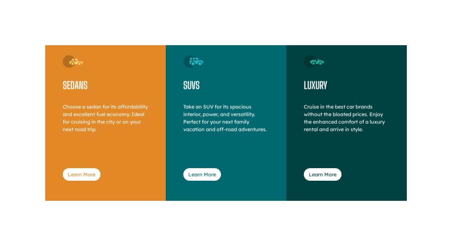
3-column preview card component
Design comparison
Solution retrospective
Is there a better way I could have centered the content on the page?
Community feedback
- @ratul0407Posted over 1 year ago
@timilehin223 congratulations on completing this challenge🎉🎉
I think you've done a very good job on this but there is minor adjustments and improvements that you can make
first on your question -- instead of using
padding: autousemin-height: 100vhon yourbodythis will allow your body to take the full height of your page and let the body grow if it's necessary ✌✌and very importantly always make sure to use
grid-template-rowsyou've given yourmaina display ofgridbut you haven't usedgrid template-rowsthat's why the page is getting this gigantic scrolling to fix that just simply setmain { display: grid; grid-template-rows: 1fr; grid-template-columns: 1fr 1fr 1fr;and the gigantic scrolling issue is fixed✔✔
I hope it was helpful to you 👍👍
Have a nice day😊😊
Marked as helpful0
Please log in to post a comment
Log in with GitHubJoin our Discord community
Join thousands of Frontend Mentor community members taking the challenges, sharing resources, helping each other, and chatting about all things front-end!
Join our Discord
