Submitted almost 2 years ago
3-column preview card component using CSS Grid

@pankaj512

Design comparison
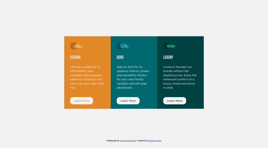
SolutionDesign

Solution retrospective
Here is solution for this using CSS grid. Please review and provide feedback. Thanks
Community feedback
- @MelvinAguilarPosted almost 2 years ago
Hi there 👋. Good job on completing the challenge ! I have some feedback for you if you want to improve your code.
HTML:
- You must use a level-one heading (h1) even though this is not a full-page challenge. You can create an '<h1>' element within your 'main' element that will be hidden visually but visible and readable by screen readers. The class "sr-only" hides content visually and here are the styles to copy. e.g.:
<h1 class="sr-only">3-column preview card component</h1>
- Not all images should have alt text. Car icons are for decoration purposes only, so they can be hidden from screen-readers by adding
aria-hidden="true"and leaving its alt attribute empty:
<img src="./images/icon-sedans.svg" alt aria-hidden="true"> <img src="./images/icon-suvs.svg" alt aria-hidden="true" > <img src="./images/icon-luxury.svg" alt aria-hidden="true" >- In this challenge, the picture tag is not needed, since the image does not need to change depending on the viewport. This is necessary when the platform provides two images, one for mobile and one for desktop. You can directly use the image tag or <div> in this solution.
CSS:
- Instead of using pixels in font-size (
--font-size: 15px;), use relative units likeemorrem. The font-size in absolute units like pixels does not scale with the user's browser settings. This can cause accessibility issues for users who have set their browser to use a larger font size. You can read more about this here.
I hope you find it useful! 😄 Above all, the solution you submitted is great!
Happy coding! 🎄
Marked as helpful1 - You must use a level-one heading (h1) even though this is not a full-page challenge. You can create an '<h1>' element within your 'main' element that will be hidden visually but visible and readable by screen readers. The class "sr-only" hides content visually and here are the styles to copy. e.g.:
- @vivekbhatt07Posted almost 2 years ago
Nicely done, but recommend you to use higher value of border-radius to make it more round. More rounded button will look nice. By the way great work 👍.
1


Please log in to post a comment
Log in with GitHubJoin our Discord community
Join thousands of Frontend Mentor community members taking the challenges, sharing resources, helping each other, and chatting about all things front-end!
Join our Discord