Not Found
Not Found
Not Found
Not Found
Not Found
Not Found
Not Found
Not Found
Not Found
Not Found
Not Found
Not Found
Not Found
Not Found
Not Found
Not Found
Not Found
Not Found
Not Found
Not Found

Submitted

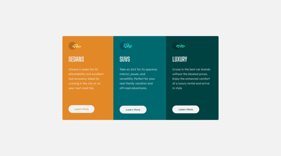
3-column card using html and css only

AbdulRhmanβ€’ 270

@Abdo-al-R

Desktop design screenshot for the 3-column preview card component coding challenge

This is a solution for...

  • HTML
  • CSS
1newbie
View challenge

Design comparison


SolutionDesign

Solution retrospective


Hello this is my solution for this challenge , any suggestions ?

Community feedback

Nikola Dβ€’ 1,450

@NikolaD93

Posted

Hello there! πŸ‘‹

Congrats for completing the challenge! Everything looks great and the code is clean, just keep up with the good work! πŸ™Œ

Hope this was helpful for you!

Happy holidays! πŸŽ‰βœŒ

Marked as helpful

1

AbdulRhmanβ€’ 270

@Abdo-al-R

Posted

@Nikola1232456 thank you very much my friend

1
ZMBβ€’ 720

@ZMBAIG

Posted

@Nikola1232456 Thanks

1

@VCarames

Posted

Hey there! πŸ‘‹ Here are some suggestions to help improve your code:

  • The β€œcar icons” in this component are purely decorative. ⚠️ Their alt tag should be left blank and have an aria-hidden=β€œtrue” to hide them from assistive technology.

More Info:πŸ“š

[MDN Aria-Hidden] (https://developer.mozilla.org/en-US/docs/Web/Accessibility/ARIA/Attributes/aria-hidden#description)

  • The headings in your component are being used incorrectly❌ . Since the h1 heading can only be used once ⚠️, it is always given to the heading with the highest level of importance. This component has three headings of equal importance, so the best option would be to use an h2 heading βœ… since it is reusable and it will give each heading the same level of importance.
  • Your "buttons" were created with the incorrect element ❌. When the user clicks on the button they should be directed to a different part of you site. The anchor tag }will achieve this.

More Info:πŸ“š

MDN The Anchor element

  • Your CSS Reset is being underutilized. 😒 To fully maximize πŸ’― it, you will want to add more to it.

Here are some examples that you can freely use:

Josh Comeau Reset

Eric Meyer Reset

  • Implement a "Mobile First" approach πŸ“± > πŸ–₯

Mobile devices are now the dominant πŸ‘‘ way in which people browse the web, it is critical that your website/content looks perfect on all mobile devices.

More Info: πŸ“š

Mobile First

  • Your content is not fully responsive. 😒 Here is a link to Google Developer’s site that will teach you how make it 100% responsive:

https://web.dev/learn/design/

  • For improved accessibility πŸ“ˆ for your content, it is best practice to use rem for your font-size and other property values. While em is best for media-queries. Using these units gives users the ability to scale elements up and down, relative to a set value.

If you have any questions or need further clarification, feel free to reach out to me.

Happy Coding! πŸŽ†πŸŽŠπŸͺ…

Marked as helpful

1

AbdulRhmanβ€’ 270

@Abdo-al-R

Posted

@vcarames borther thank you very much thats a very rich info .. thanks alot

0

Please log in to post a comment

Log in with GitHub
Discord logo

Join our Discord community

Join thousands of Frontend Mentor community members taking the challenges, sharing resources, helping each other, and chatting about all things front-end!

Join our Discord