Design comparison
Solution retrospective
my second project, is there any tool that helps with media queries? my main difficulty
Community feedback
- @VCaramesPosted almost 2 years ago
Hey there! 👋 Here are some suggestions to help improve your code:
is best practice to use, classes for your naming convention as classes are reusable, making them ideal for CSS styling. IDs on the other hand, are not reusable and are mainly used for JavaScript.
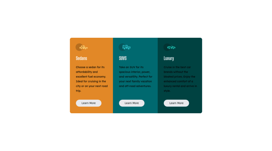
- The “car images/icons” in this component are purely decorative; They add no value. So their
Alt Tag
should be left blank and have anaria-hidden=“true”
to hide them from assistive technology.
More Info:📚
https://www.w3.org/WAI/tutorials/images/
- The headings in your component are being used incorrectly. Since the
h1
heading can only be used once, it is always given to the heading with the highest level of importance. This component has three headings of equal importance, so the best option would be to use anh2
heading since it is reusable and it will give each heading the same level of importance.
- Your "buttons" were created with the incorrect element. When the user clicks on the button they should be directed to a different part of you site. The
anchor tag
will achieve this.
More Info:📚
If you have any questions or need further clarification, feel free to reach out to me.
Happy Coding!🎄🎁
Marked as helpful0 - The “car images/icons” in this component are purely decorative; They add no value. So their
- @catherineisonlinePosted almost 2 years ago
Responsiveness looks fine especially if you don't know it much. I also always had issues with media queries but when you do it many times it's getting easier. You can also watch some Youtube guides as well.
As for the container paragraphs, p tags, make sure to set the color to white instead of black, to match the design 😎
Marked as helpful0 - @BeziesPosted almost 2 years ago
Your media queries seem ok. You can very well add them to your style.css file, it's even the simplest.
- I don't think you need to add html besides body for the first line.
Also, your code lacks 2-3 small adjustments such as the color of the paragraphs or the buttons. Just add a class to each button and then style them with your css.
It's a good start though
Marked as helpful0@andersonrodrigodPosted almost 2 years ago@Bezies thanks, I will pay attention to the details
0
Please log in to post a comment
Log in with GitHubJoin our Discord community
Join thousands of Frontend Mentor community members taking the challenges, sharing resources, helping each other, and chatting about all things front-end!
Join our Discord