Design comparison
Community feedback
- @catherineisonlinePosted almost 2 years ago
Nice! 🙌🏻
I would also add some transitions for active states (when colors change on hover). It creates more interactivity and makes the project looks cooler. Active states can be done on buttons, links, titles which act like links or anything else, you choose.
You can read more about it here, in case you haven’t done much of it: https://www.w3schools.com/css/css3_transitions.asp
IF THIS WAS HELPFUL PLEASE MARK IT AS HELPFUL 🤩
Marked as helpful0@EudesSerpaPosted almost 2 years ago@catherineisonline
Hi, Catherine! Thanks for your comment. I also thought the same thing too but I forgot. I'll add it😄
0 - @EudesSerpaPosted almost 2 years ago
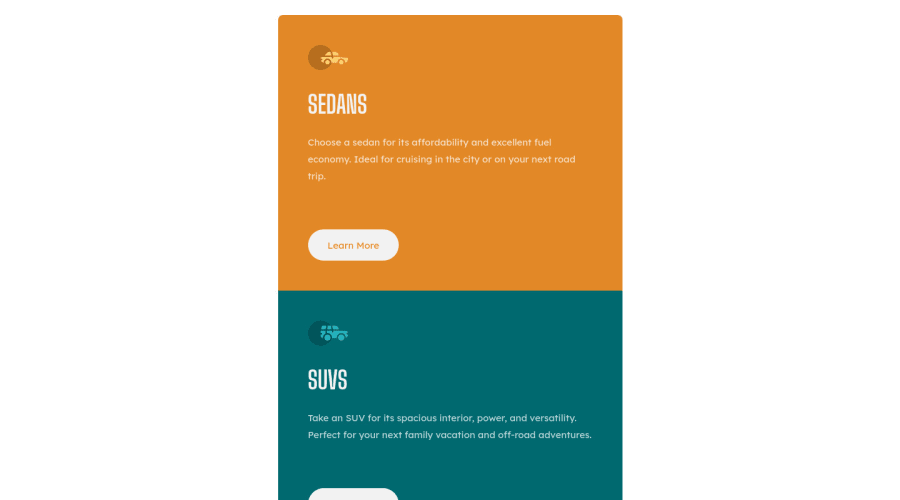
The screenshot is wrong 😓 not quite sure why. It's like it's taken at about 600px wide. How I can improve it?
0@Nadine-GreenPosted almost 2 years ago@EudesSerpa
HEY EUDES!
Concerning your problem with the screen shot, you Williams to generate a new ne, the button to do so should be located just above the screenshot itself.
You should also consider making your breakpoint to mobile design to something below 1000px so that the mobile design does not show up on laptops
IF YOU FOUND THIS IN ANYWAY USEFUL, DO NOT HESITATE TO MARK IT AS HELPFUL :)
HAPPY CODING!
Marked as helpful0@EudesSerpaPosted almost 2 years ago@Nadine-Green
Hi Favor! Thanks for your help 😄. I tried to generate a new screenshot but the result is the same (I have 1 screenshot left this month xD). I guess it's because I don't have breakpoints since I used css grid for the responsive. But that's okay, it's just weird to see that screenshot 😂.
0@Nadine-GreenPosted almost 2 years ago@EudesSerpa
Happy I could help
I too wish that they increased the screenshot limit :)
0
Please log in to post a comment
Log in with GitHubJoin our Discord community
Join thousands of Frontend Mentor community members taking the challenges, sharing resources, helping each other, and chatting about all things front-end!
Join our Discord
