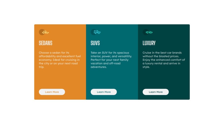
Design comparison
Solution retrospective
Any feedback?
Community feedback
- @danielmrz-devPosted 10 months ago
Hello @iabdwahab!!
Your solution looks great!
I have a suggestion (about semantic HTML) for improvement:
📌 Use
<h1>to<h6>for titles instead of<p>.The tag
<p>is meant for paragraphs. For titles, we have the HTML headings (the tags<h1>to<h6>).Here's a quick guide on how to use them:
Unlike what most people think, it's not just about the size and weight of the text.
- The
<h1>to<h6>tags are used to define HTML headings. <h1>defines the most important heading.<h6>defines the least important heading.- Only use one
<h1>per page - this should represent the main heading/title for the whole page. And don't skip heading levels - start with<h1>, then use<h2>, and so on.
This project is not very obvious about what is the main title, so you can use a hidden
<h1>and use<h2>for all the three titles of the cards.All these tag changes may have little or any visual impact but they make your HTML code more semantic and improve SEO optimization as well as the accessibility of your project.
I hope it helps!
Other than that, great job!
Marked as helpful1 - The
Please log in to post a comment
Log in with GitHubJoin our Discord community
Join thousands of Frontend Mentor community members taking the challenges, sharing resources, helping each other, and chatting about all things front-end!
Join our Discord
